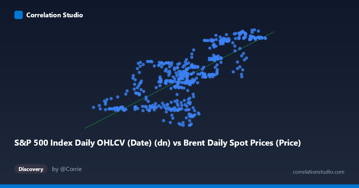
S&P 500 Index Daily OHLCV (Date) (dn) vs Brent Daily Spot Prices (Price)
- Pearson correlation (r)
- 0.7353
- Spearman correlation
- 0.7167
- p-value
- 0
- Sample size (n)
- 504
- 95% confidence interval
- 0.6924 to 0.773
- Granger causality
- None
- Granger optimal lag
- 1
AI analysis
Scatterplot Analysis: Brent Crude Oil Prices vs. S&P 500 Index (2015–2017)
Relationship Overview
The scatterplot reveals a moderate-to-strong positive relationship between daily Brent crude oil spot prices (X-axis, USD/barrel) and the S&P 500 Index (Y-axis) over the two-year period from February 2015 to February 2017. As Brent crude prices rise from roughly $26 to $66 per barrel, S&P 500 values trend upward from approximately $85 to $127 (in the normalized or indexed units represented here). The linear regression equation y = 0.952x + 61.35 suggests that for every $1 increase in Brent crude, the S&P 500 proxy rises by roughly 0.95 units — an unusually tight co-movement for two assets that have historically shown a more complex, often inverse relationship in other time periods.
Correlation Strength and Statistical Significance
The Pearson correlation of r = 0.7353 indicates a meaningfully strong positive association, and critically, the R² of 0.5406 tells us that approximately 54% of the variance in the S&P 500 measure is statistically explained by Brent crude prices during this window. While substantial, this also means ~46% of variance is driven by other factors not captured here. The 95% confidence interval of [0.692, 0.773] is relatively narrow given the large sample (n = 504), reinforcing that this correlation estimate is stable and not a statistical artifact. The p-value of essentially 0 confirms the relationship is highly significant. However, the Granger causality results complicate the narrative considerably: neither X→Y (F = 0.2475, p = 0.619) nor Y→X (F = 0.1210, p = 0.728) achieves significance at any conventional threshold with a 1-period lag. This means that despite the strong contemporaneous correlation, neither variable temporally predicts the other — both are almost certainly responding to the same underlying macroeconomic forces rather than one driving the other.
Patterns, Clusters, and Outliers
Several notable structural features are visible in the sample points. There appears to be a broad central cluster concentrated between X ≈ 43–55 and Y ≈ 100–115, representing typical trading conditions during this period. A distinct lower-left cluster exists around X ≈ 29–37 and Y ≈ 92–100, corresponding to the oil price crash period of early 2015–2016 when Brent briefly dipped below $30. A upper-right cluster around X ≈ 57–65 and Y ≈ 122–127 captures the recovery phase. Notably, several outliers deviate from the trend: points like (50.73, 90.48), (46.08, 86.29), (49.76, 90.12), and (49.04, 115.29) show wide vertical scatter at similar X values (~47–50), suggesting that at mid-range oil prices, the S&P 500 exhibited considerable independent variability. This heteroscedasticity — tighter fit at extremes, looser in the middle — hints that the relationship may not be purely linear.
Confounding Factors and Caveats
This correlation almost certainly reflects shared macro-regime dependency rather than a direct causal link. The 2015–2017 period was characterized by distinct risk-on/risk-off cycles: the global commodity downturn (2015–early 2016), concerns about Chinese economic slowdown, and the subsequent coordinated recovery all affected both oil prices and equities simultaneously. Both variables were effectively acting as proxies for global economic sentiment. Additionally, the axis labels suggest a possible dataset alignment issue — the X-axis column appears to originate from the Brent dataset but is labeled as an S&P column attribute, and vice versa, warranting careful verification of the data join logic. The relatively short two-year window also means this correlation is highly period-specific and should not be generalized; historically, oil and equities have shown neutral or even negative correlations across longer horizons.
Actionable Insights and Further Investigation
Given the absence of Granger causality, traders and analysts should not use Brent prices as a leading indicator for S&P 500 movements (or vice versa) based on this dataset alone. Instead, investigating the common driver — such as global risk appetite indices, USD strength, or Chinese industrial demand data — would be more productive. Further analysis should include: (1) extending the time horizon to 10–20 years to test whether this positive correlation is structural or cyclical; (2) rolling correlation analysis to identify regime changes; (3) testing non-linear models (e.g., polynomial or piecewise regression) to address the apparent heteroscedasticity; and (4) multivariate regression incorporating the VIX, DXY (dollar index), and global PMI data to properly isolate the oil-equity relationship and identify the true confounding variables driving this co-movement.
X dataset: Brent Daily Spot Prices
Y dataset: S&P 500 Index Daily OHLCV (Date)
Part of experiment: Daily - Brent Daily Spot Prices vs S&P 500 Index Daily OHLCV (Date)