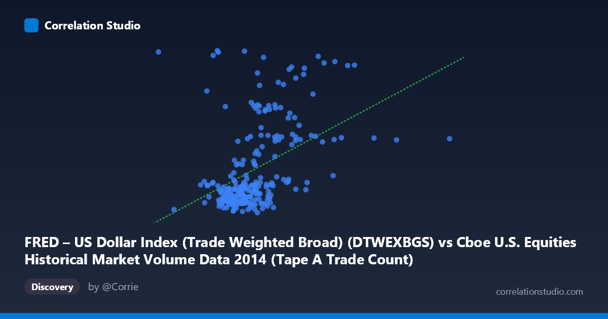
FRED – US Dollar Index (Trade Weighted Broad) (DTWEXBGS) vs Cboe U.S. Equities Historical Market Volume Data 2014 (Tape A Trade Count)
- Pearson correlation (r)
- 0.4258
- Spearman correlation
- 0.4662
- p-value
- 0
- Sample size (n)
- 245
- 95% confidence interval
- 0.3174 to 0.5232
- Granger causality
- None
- Granger optimal lag
- 1
AI analysis
Scatterplot Analysis: US Dollar Index vs. Cboe Tape A Trade Count (2014)
Relationship Overview The scatterplot reveals a modest positive relationship between the Trade Weighted Broad US Dollar Index (X-axis) and the Cboe Tape A Trade Count (Y-axis) across 245 paired daily observations spanning the full calendar year 2014. The linear regression equation (y = 4.417E-06x + 90.346) indicates that as the dollar index rises, trade count tends to increase slightly. However, the scatter is substantial, and the relationship is far from clean — a large mass of points clusters in a relatively narrow band, with several elevated Y-values distributed across a wide X range, suggesting the linear model captures only a portion of the underlying dynamics.
Correlation Strength and Statistical Significance The Pearson correlation of r = 0.4258 indicates a weak-to-moderate positive association, but the R² of 0.1813 is the more grounding statistic: only 18.1% of the variance in Tape A Trade Count is explained by the Dollar Index, meaning roughly 82% of variation is attributable to other factors. The relationship is nonetheless statistically significant (p = 3.285E-12), which is unsurprising given the large population context (N = 3,686), and the 95% confidence interval of [0.317, 0.523] confirms the effect is reliably positive but modest in magnitude. Critically, Granger causality tests find no significant predictive directionality in either direction — neither X→Y (F = 0.417, p = 0.519) nor Y→X (F = 0.818, p = 0.367) reaches significance at a 1-lag structure. This means that while the two variables are contemporaneously correlated, neither reliably predicts the other the following day, severely limiting any causal or forecasting interpretation.
Notable Patterns and Outliers The point cloud exhibits a distinctive structural feature: a dense horizontal cluster of points concentrated around Y ≈ 93–96 (low-to-moderate trade counts) spanning X values from roughly 950,000 to 1,400,000, suggesting a "floor" regime of normal trading activity. Above this, a dispersed band of elevated trade count observations (Y ≈ 97–102) appears scattered across the X range, creating a heteroscedastic pattern where variance in Y increases at higher X values. Several prominent outliers are visible — notably points near (527,319, 102.30), (1,253,315, 101.99), (1,535,187, 101.37), and (2,537,988, 97.35) — which pull the regression line upward and likely inflate the correlation coefficient. The extreme X-axis outlier at ~2.54 million is particularly noteworthy and warrants scrutiny as a potential data anomaly.
Confounding Factors and Caveats Several important caveats complicate interpretation. First, both variables are time-series in 2014, a year marked by a significant USD rally in Q3–Q4 alongside distinct equity market volatility episodes (e.g., October 2014 correction), meaning shared temporal trends — rather than a direct causal link — could be driving the observed correlation. This is a classic spurious correlation through common time trends. Second, Tape A trade count reflects trading activity on NYSE-listed securities specifically, which is subject to factors entirely independent of the dollar, including index rebalancing, earnings seasons, algorithmic trading volumes, and regulatory microstructure changes. Third, the extreme outliers at both ends of the X distribution may represent data entry errors, non-trading days, or index recalculation events that disproportionately influence the regression fit. Fourth, the relationship may be non-linear or regime-dependent, with the elevated Y-value cluster potentially corresponding to specific high-volatility market events rather than a continuous dollar-driven effect.
Actionable Insights and Further Investigation Given the low explained variance and absence of Granger causality, practitioners should not use the Dollar Index as a standalone predictor of daily trade counts. However, the contemporaneous correlation is real and worth probing further. Recommended next steps include: (1) decomposing the time series to remove shared trends and re-testing the correlation on residuals to assess whether the relationship survives detrending; (2) investigating the high-Y outlier cluster to determine whether they correspond to specific market events (VIX spikes, FOMC announcements, options expiration dates) that might explain both elevated volume and dollar movements simultaneously; (3) extending the Granger analysis to longer lags (5–10 periods) to check for delayed effects; and (4) incorporating additional covariates — VIX, S&P 500 returns, Fed policy announcements — into a multivariate model to better account for the remaining 82% of unexplained variance.
X dataset: Cboe U.S. Equities Historical Market Volume Data 2014
Y dataset: FRED – US Dollar Index (Trade Weighted Broad)
Part of experiment: Daily - Cboe U.S. Equities Historical Market Volume Data 2014 vs FRED – US Dollar Index (Trade Weighted Broad)