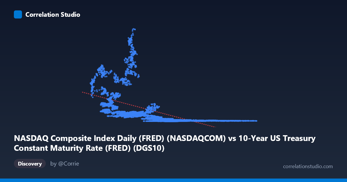
NASDAQ Composite Index Daily (FRED) (NASDAQCOM) vs 10-Year US Treasury Constant Maturity Rate (FRED) (DGS10)
- Pearson correlation (r)
- -0.5201
- Spearman correlation
- -0.8251
- p-value
- 0
- Sample size (n)
- 13799
- 95% confidence interval
- -0.5322 to -0.5078
- Granger causality
- None
- Granger optimal lag
- 10
AI analysis
Analysis: NASDAQ Composite vs. 10-Year US Treasury Yield
1. What the Visualization Reveals
The scatterplot depicts a broadly negative relationship between the 10-Year US Treasury Constant Maturity Rate (X-axis) and the NASDAQ Composite Index (Y-axis), spanning over five decades (1971–2026). At lower interest rates (roughly 0.5%–5%), NASDAQ values scatter widely and reach their highest levels — often exceeding 5,000–15,000+ points — while at higher rates (8%–16%), NASDAQ values cluster tightly near the bottom, rarely exceeding 1,000. This pattern is visually consistent with the well-established financial intuition that lower rates tend to support higher equity valuations, particularly for growth-oriented indices like the NASDAQ. The spread is notably heteroscedastic — variance in NASDAQ values is far greater at low interest rate levels than at high ones.
2. Correlation Strength, Direction, and Statistical Context
The Pearson correlation of r = −0.52 indicates a moderate negative linear association, but the explanatory power is more sobering: R² = 0.27, meaning only about 27% of the variance in NASDAQ values is explained by Treasury yields in a linear framework. The remaining ~73% of variance is driven by other factors entirely. The 95% confidence interval of [−0.532, −0.508] is narrow and excludes zero, and the p-value is effectively zero, confirming this relationship is highly statistically significant given the large sample (n ≈ 13,799). However, statistical significance here should not be confused with practical determinism — this is a noisy, complex relationship.
Critically, the Granger causality tests show no significant predictive directionality in either direction (X→Y: F = 0.39, p = 0.95; Y→X: F = 0.88, p = 0.55) at an optimal lag of 10 periods. This is a meaningful finding: even though the two series are correlated contemporaneously, neither variable reliably predicts the other temporally. This undermines any naive strategy of using rate movements to time NASDAQ entries or exits in a systematic, lagged fashion.
3. Notable Patterns, Clusters, and Non-Linearity
Several features stand out in the data:
- High-rate cluster (X 8%): NASDAQ values compress tightly below ~1,000, reflecting the pre-2000 era when both rates and nominal index values were lower. This is a temporally confounded region — high rates and low NASDAQ values largely co-occur in the 1970s–1990s, not necessarily because of rates alone. - Low-rate dispersion (X < 5%): Enormous spread in Y, from near zero to 26,000+, suggesting that at low rates, factors other than yield dominate NASDAQ performance. Notable outliers appear above 14,000–15,000 (e.g., points at X ≈ 1.23–1.78, Y ≈ 14,000–15,000), likely corresponding to the post-2020 zero-rate era and pandemic-era tech bubble. - Non-linearity: The note that Spearman ρ Pearson r confirms a non-linear monotonic relationship fits better than a straight line. The linear regression (y = −823.96x + 8197.36) likely underestimates NASDAQ at very low rates and overestimates it at moderate rates. A logarithmic or power-law model would better capture the hyperbolic-looking decay visible in the scatter.
4. Confounding Factors and Caveats
This correlation should be interpreted with substantial caution:
- Time and trend confounding: Both series have strong secular trends. NASDAQ has grown exponentially over 50 years while rates have followed a long arc — declining from ~16% in the early 1980s to near 0% by 2021, then rebounding. Much of the negative correlation may reflect shared time trends rather than a direct causal mechanism. - Regime changes: The relationship is not stable across time. The 1970s–80s high-inflation era, the 1990s tech boom, the 2008–2020 zero-rate era, and the 2022 rate-hike cycle each represent structurally different regimes where the rate-equity relationship behaved differently. - Nominal vs. real effects: The NASDAQ is a nominal price index not adjusted for inflation or dividends, while the 10-year yield embeds inflation expectations. Comparing them directly without real-rate or earnings yield adjustments is inherently imprecise. - Omitted variables: Earnings growth, fiscal policy, risk appetite, global capital flows, and technological disruption all substantially drive NASDAQ valuations independently of interest rates.
5. Actionable Insights and Further Investigation
- Replace linear regression with a logarithmic or inverse model (e.g., Y = a·e^(−bX) or Y = a/X^b), which would better capture the hyperbolic decay pattern and improve predictive accuracy meaningfully beyond R² = 0.27. - Segment the analysis by era (e.g., pre-1990, 1990–2008, 2009–2019, 2020–present) to test whether the correlation is stable or regime-dependent — this is likely the most revealing next step given the temporal confounding. - Use real (inflation-adjusted) interest rates and NASDAQ earnings yield or P/E ratios rather than raw index levels for a more theoretically grounded analysis. - Investigate co-integration rather than Granger causality, as two non-stationary series may share a long-run equilibrium relationship even without short-term predictive directionality. - Given the lack of Granger causality, practitioners should not use Treasury yield changes as a short-term trading signal for NASDAQ positioning; the relationship appears structural and long-term rather than operationally predictive.
X dataset: 10-Year US Treasury Constant Maturity Rate (FRED)
Y dataset: NASDAQ Composite Index Daily (FRED)
Part of experiment: Daily - 10-Year US Treasury Constant Maturity Rate (FRED) vs NASDAQ Composite Index Daily (FRED)