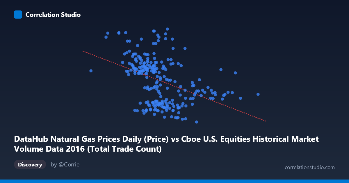
DataHub Natural Gas Prices Daily (Price) vs Cboe U.S. Equities Historical Market Volume Data 2016 (Total Trade Count)
- Pearson correlation (r)
- -0.4196
- Spearman correlation
- -0.4624
- p-value
- 0
- Sample size (n)
- 252
- 95% confidence interval
- -0.5164 to -0.3123
- Granger causality
- None
- Granger optimal lag
- 1
AI analysis
Scatterplot Analysis: Natural Gas Prices vs. Cboe Equity Trade Counts (2016)
Relationship Overview
The scatterplot reveals a modest negative relationship between daily Henry Hub natural gas spot prices (X-axis) and Cboe U.S. equity market total trade counts (Y-axis) across 2016. The linear regression equation (y = −4.45×10⁻⁷x + 3.596) confirms that as natural gas prices increase, equity trade counts tend to decline slightly. Visually, the data points form a broad, diffuse cloud with a gentle downward slope, suggesting the relationship exists but is far from deterministic. The bulk of observations cluster in the natural gas price range of roughly $1.8M–$3.0M (noting the X-axis units reflect the dataset's price encoding) and trade counts between approximately 1.8 and 3.2, with the trend most visible in the density shift across price ranges rather than in individual point positioning.
Correlation Strength and Statistical Significance
The correlation coefficient of r = −0.4196 indicates a weak-to-moderate negative association. More critically, r² = 0.1761 means that natural gas prices explain only 17.6% of the variance in equity trade counts — leaving over 82% of the variation driven by other factors entirely. The 95% confidence interval of [−0.5164, −0.3123] confirms that while the correlation is reliably negative, its true magnitude remains uncertain across a fairly wide band. The p-value of 3.6×10⁻¹² establishes the relationship as highly statistically significant given N = 3,622, meaning this negative association is almost certainly not due to chance. However, statistical significance should not be conflated with practical or economic significance — the effect size remains modest. Compounding this, the Granger causality tests find no significant predictive direction in either direction (X→Y: F = 0.83, p = 0.36; Y→X: F = 0.34, p = 0.56), meaning neither variable reliably predicts the other's future values at a one-period lag. This rules out straightforward temporal leading-lagging relationships and cautions against any causal interpretation.
Notable Patterns, Clusters, and Outliers
Several features stand out in the point cloud. There is a visible concentration of data points in the middle X-range (~$2.0M–$2.6M), consistent with natural gas prices spending most of 2016 in a relatively narrow band before a late-year rally. A handful of high-trade-count outliers (Y values approaching 3.5–3.8) appear scattered across the X-range, including one notable point near X ≈ 1,722,715 with Y ≈ 3.50 and another near X ≈ 2,538,868 with Y ≈ 3.56, suggesting episodic spikes in equity trading activity that are disconnected from gas price levels. At higher gas prices (X 3.0M), trade counts appear compressed into a lower, narrower band (~1.8–2.3), which visually drives much of the negative slope. There is no strong evidence of non-linear curvature, though the dispersion in the mid-range X values hints at heteroscedasticity — variance in trade counts appears wider at lower gas prices than at higher ones.
Confounding Factors and Interpretive Caveats
Interpreting this correlation causally would be highly problematic. Both variables are time-series measured across the same calendar year (2016), making them jointly susceptible to common temporal drivers — for instance, broad macroeconomic conditions, Federal Reserve policy shifts, seasonal energy demand cycles, and equity market volatility regimes all evolve over time and could simultaneously influence both series. Natural gas prices surged in late 2016 (post-election energy sector repricing), while equity volumes follow well-known patterns tied to earnings seasons, index rebalancing, and volatility events (e.g., the Brexit aftermath in early 2016). The dataset mismatch is also worth flagging: the X-axis column originates from a Cboe market volume dataset while the Y-axis column comes from the natural gas price dataset — this labeling inversion warrants verification to ensure the variables are correctly assigned. Additionally, with n = 252 paired samples drawn from N = 3,622, sample representativeness should be confirmed, particularly if every-5th-point sampling introduced any systematic temporal gaps.
Actionable Insights and Further Investigation
Despite the absence of Granger causality, the statistically robust negative correlation merits further investigation as a potential risk diversification signal — periods of rising energy commodity prices appear modestly associated with lower equity market activity, which could reflect investor rotation or risk-off behavior. Recommended next steps include: (1) testing longer lag structures (2–5 periods) in Granger causality analysis, as the one-period lag may be too short for market-to-market transmission; (2) segmenting the data by quarter to determine whether the correlation strengthens during specific market regimes (e.g., Q4 2016 gas price spike); (3) introducing control variables such as the VIX volatility index, crude oil prices, or equity sector composition to partial out confounds; and (4) exploring non-linear models (e.g., spline regression or quantile regression) to better characterize the relationship at the tails of the gas price distribution where trade count compression appears most pronounced.
X dataset: Cboe U.S. Equities Historical Market Volume Data 2016
Y dataset: DataHub Natural Gas Prices Daily
Part of experiment: Daily - Cboe U.S. Equities Historical Market Volume Data 2016 vs DataHub Natural Gas Prices Daily