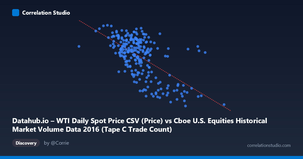
Datahub.io – WTI Daily Spot Price CSV (Price) vs Cboe U.S. Equities Historical Market Volume Data 2016 (Tape C Trade Count)
- Pearson correlation (r)
- -0.6178
- Spearman correlation
- -0.5358
- p-value
- 0
- Sample size (n)
- 252
- 95% confidence interval
- -0.6888 to -0.5351
- Granger causality
- None
- Granger optimal lag
- 1
AI analysis
Analysis: WTI Oil Price vs. Cboe Tape C Trade Count (2016)
Relationship Overview The scatterplot reveals a moderate negative relationship between WTI daily spot oil prices (X-axis) and Cboe Tape C trade counts (Y-axis) across 252 trading days in 2016. As oil prices increase, trade counts on Tape C (NYSE Arca and related venues) tend to decrease. The linear regression equation (y = -2.85×10⁻⁵x + 63.61) quantifies this inverse slope, suggesting that for every $1 increase in WTI price per barrel, Tape C trade counts decline by a small but consistent amount. Visually, the data cloud tilts downward from left to right, though with considerable scatter around the trend line, indicating this is a real but imperfect relationship.
Correlation Strength and Statistical Significance The Pearson correlation of r = -0.618 represents a moderate-to-strong negative association. However, r² = 0.382 is the more informative metric: only 38.2% of the variance in Tape C trade counts is explained by oil price variation, meaning roughly 62% of trading activity fluctuations are driven by other factors entirely. The 95% confidence interval of [-0.689, -0.535] is reasonably tight and excludes zero, and the p-value of effectively 0 confirms this correlation is highly unlikely to be a chance artifact in a sample of n=252 drawn from N=3,622. That said, statistical significance at this scale should not be conflated with practical or causal importance. Critically, the Granger causality tests failed in both directions (X→Y: F=0.694, p=0.406; Y→X: F=0.949, p=0.331), meaning neither variable temporally predicts the other at a 1-period lag. This is a crucial finding — despite the strong correlation, there is no evidence of predictive temporal directionality, strongly cautioning against any causal narrative.
Patterns, Clusters, and Outliers The sample points reveal several notable structural features. There appears to be a cluster of high trade counts (45–52) concentrated in the X range of roughly 500,000–750,000, suggesting a regime where moderate oil prices coincide with elevated equity trading activity. Conversely, several clear outliers occupy the lower-right quadrant — points like (1,023,027, 29.55), (990,202, 33.21), (849,071, 31.62), and (914,264, 32.32) show unusually high oil prices paired with very low trade counts, pulling the regression slope significantly. These high-X, low-Y outliers are consistent with late-2016 trading patterns when oil prices recovered toward year-end. There is also a possible non-linear or threshold effect: trade counts appear relatively stable across a wide mid-range of oil prices but drop sharply only at the highest price levels, suggesting the relationship may not be purely linear.
Confounding Factors and Caveats Several important caveats apply. First, both variables are time-indexed to 2016, meaning shared temporal trends — such as the oil price recovery from early-2016 lows and concurrent shifts in equity market volatility — could be driving the correlation spuriously through a common time trend rather than any direct mechanism. Second, Tape C trade count is a venue-specific metric influenced by market structure changes, exchange fee adjustments, and algorithmic routing decisions that have nothing to do with oil prices. Third, WTI price levels in 2016 were historically unusual, ranging from post-crash lows (~$26–30/barrel in February) to partial recovery (~$54/barrel by December), compressing the natural variance range. Finally, the failure of Granger causality tests suggests any apparent lead-lag relationship is noise, and the correlation likely reflects a co-movement with a common underlying driver such as overall market risk sentiment or macroeconomic conditions rather than a direct mechanism.
Actionable Insights and Further Investigation Given the moderate correlation but absent Granger causality, this relationship warrants deeper decomposition rather than direct predictive application. Analysts should detrend both series to remove shared temporal drift before re-evaluating the correlation, which may significantly reduce or reframe the r value. It would be valuable to extend the analysis beyond 2016 to test whether this negative correlation persists across different oil price regimes or is an artifact of the specific 2016 recovery cycle. Investigating other Tape designations (A and B) alongside Tape C could reveal whether this is a venue-specific phenomenon or a broader equity market pattern. Additionally, including VIX or implied volatility as a control variable could disentangle whether it is oil price per se or the risk-off/risk-on environment that drives trade count variation. Finally, given the visible outlier cluster at high X values, a regime-switching or piecewise regression model may better capture the apparent threshold behavior than a single linear fit.
X dataset: Cboe U.S. Equities Historical Market Volume Data 2016
Y dataset: Datahub.io – WTI Daily Spot Price CSV
Part of experiment: Daily - Cboe U.S. Equities Historical Market Volume Data 2016 vs Datahub.io – WTI Daily Spot Price CSV