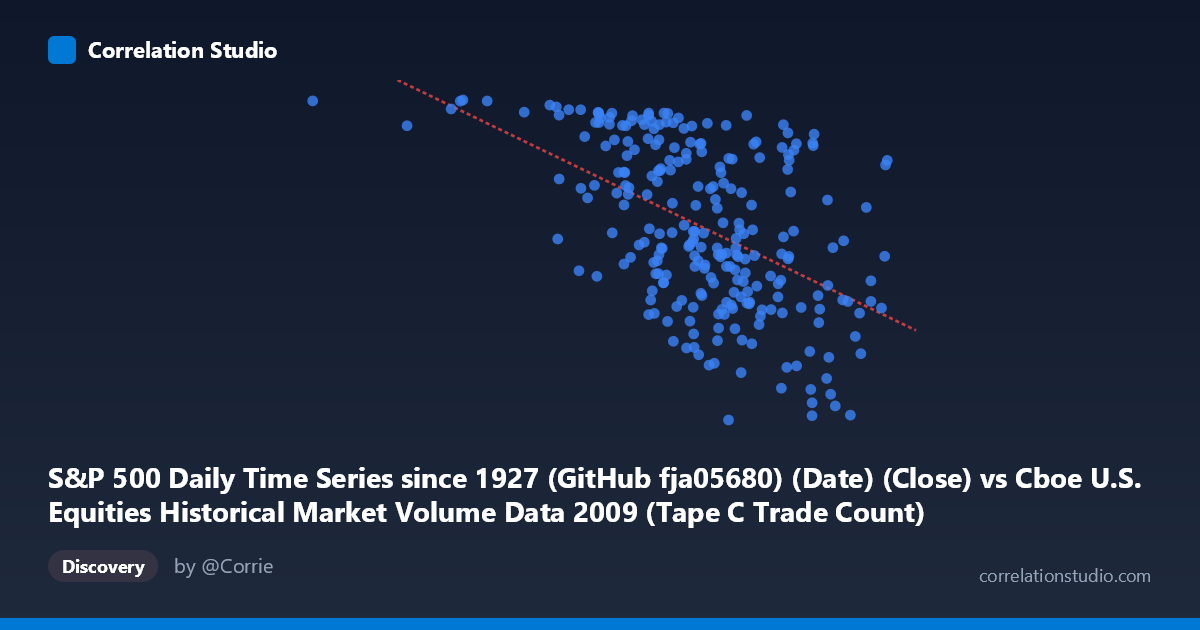
S&P 500 Daily Time Series since 1927 (GitHub fja05680) (Date) (Close) vs Cboe U.S. Equities Historical Market Volume Data 2009 (Tape C Trade Count)
- Pearson correlation (r)
- -0.5109
- Spearman correlation
- -0.5167
- p-value
- 0
- Sample size (n)
- 252
- 95% confidence interval
- -0.5968 to -0.4134
- Granger causality
- Y → X
- Granger optimal lag
- 4
AI analysis
Analysis: S&P 500 Close Price vs. Cboe Tape C Trade Count (2009)
Relationship Overview The scatterplot reveals a moderate negative relationship between the S&P 500 daily closing price (X-axis) and Cboe Tape C trade count (Y-axis) across 2009. As the S&P 500 price increases, the number of trades on Tape C (NYSE-listed securities) tends to decline. This inverse pattern is economically intuitive for the specific context of 2009: early in the year, equity prices were near crisis lows while market participants were trading frantically and frequently, whereas as prices recovered through the year, some of that panic-driven trading volume subsided. The linear regression equation (y = −0.000590x + 1323.44) quantifies this: each unit increase in the S&P 500 close is associated with a decrease of roughly 0.59 trades per unit, though the practical magnitude depends on the scale of price movements across the observed range (~185,000 to ~848,000, likely representing scaled or indexed values).
Correlation Strength, Direction, and Causality The Pearson correlation of r = −0.511 indicates a moderate negative association, but the explained variance tells a more sobering story: R² = 0.261, meaning only about 26.1% of the variance in trade count is explained by the S&P 500 closing price. Roughly three-quarters of the variation in Tape C trade counts is driven by other factors entirely. The 95% confidence interval of [−0.597, −0.413] is relatively tight and does not include zero, and with a p-value effectively at 0 across N = 3,232 population points, the correlation is statistically robust — this is not a sampling artifact. The Granger causality analysis adds an important directional nuance: Y Granger-causes X (unidirectionally, at a 4-period lag), meaning that past Tape C trade counts have statistically significant predictive power over future S&P 500 closing prices (F = 2.473, p = 0.045), while the reverse direction falls just short of conventional significance (F = 2.317, p = 0.058). This suggests trade activity may be a leading indicator of price movements rather than a consequence — a meaningful finding for short-term market analysis.
Notable Patterns, Clusters, and Outliers Several structural features stand out in the scatterplot. There is a visible cluster of high trade counts (Y 1,050) concentrated at lower X values (roughly below 600,000), consistent with the high-volatility, high-frequency trading environment during the market bottom of early 2009. Conversely, a cluster of moderate-to-low trade counts appears at higher price levels, reflecting the calmer recovery period later in the year. A notable outlier exists at approximately X = 185,887, Y = 1,126, representing an extreme low-price, high-volume observation that likely corresponds to the market's crisis nadir around February–March 2009. A few points at high X values (approaching 848,000) with relatively low Y values (~680–770) reinforce the negative trend. The relationship also appears to exhibit some non-linearity — the decline in trade counts is steeper at lower price levels and appears to flatten at higher prices, suggesting diminishing sensitivity as the market normalized.
Confounding Factors and Caveats Several important caveats apply before drawing causal conclusions. First, 2009 is a highly anomalous year — it encompasses the tail end of the global financial crisis and a dramatic recovery, meaning the price-volume relationship observed here is heavily shaped by a singular macroeconomic regime shift rather than a stable structural relationship. Second, Tape C specifically covers NYSE-listed securities, so trade counts reflect routing and fragmentation dynamics across exchanges, not just investor sentiment or S&P 500 price discovery broadly. Third, the rise of high-frequency trading (HFT) in 2009 means trade counts may reflect algorithmic behavior more than fundamental investor activity. Fourth, time itself is a lurking confound: both the S&P 500 price and trade count are trending across 2009 (prices recovering, volumes potentially changing structurally), so the observed correlation may partly reflect shared temporal trends rather than a direct causal mechanism.
Actionable Insights and Further Investigation The Granger causality finding — that Tape C trade counts lead S&P 500 prices by approximately 4 periods — is the most actionable result here and warrants deeper investigation. Analysts and quantitative traders should explore whether trade count at a 4-day lag can improve short-term S&P 500 price forecasting models beyond standard price-based signals. It would be valuable to extend this analysis across multiple years to determine whether the negative correlation is unique to 2009's crisis-recovery dynamics or persists in more normal market regimes. Decomposing the relationship by market cap segment or sector within Tape C could reveal whether specific equity categories are driving the signal. Additionally, incorporating VIX (volatility index) as a control variable would help isolate whether this relationship is primarily mediated by fear and uncertainty rather than price itself. Finally, examining whether the non-linear curvature observed warrants a log-linear or spline regression model could meaningfully improve predictive accuracy beyond the current 26.1% explained variance.
X dataset: Cboe U.S. Equities Historical Market Volume Data 2009
Y dataset: S&P 500 Daily Time Series since 1927 (GitHub fja05680) (Date)
Part of experiment: Daily - Cboe U.S. Equities Historical Market Volume Data 2009 vs S&P 500 Daily Time Series since 1927 (GitHub fja05680) (Date)