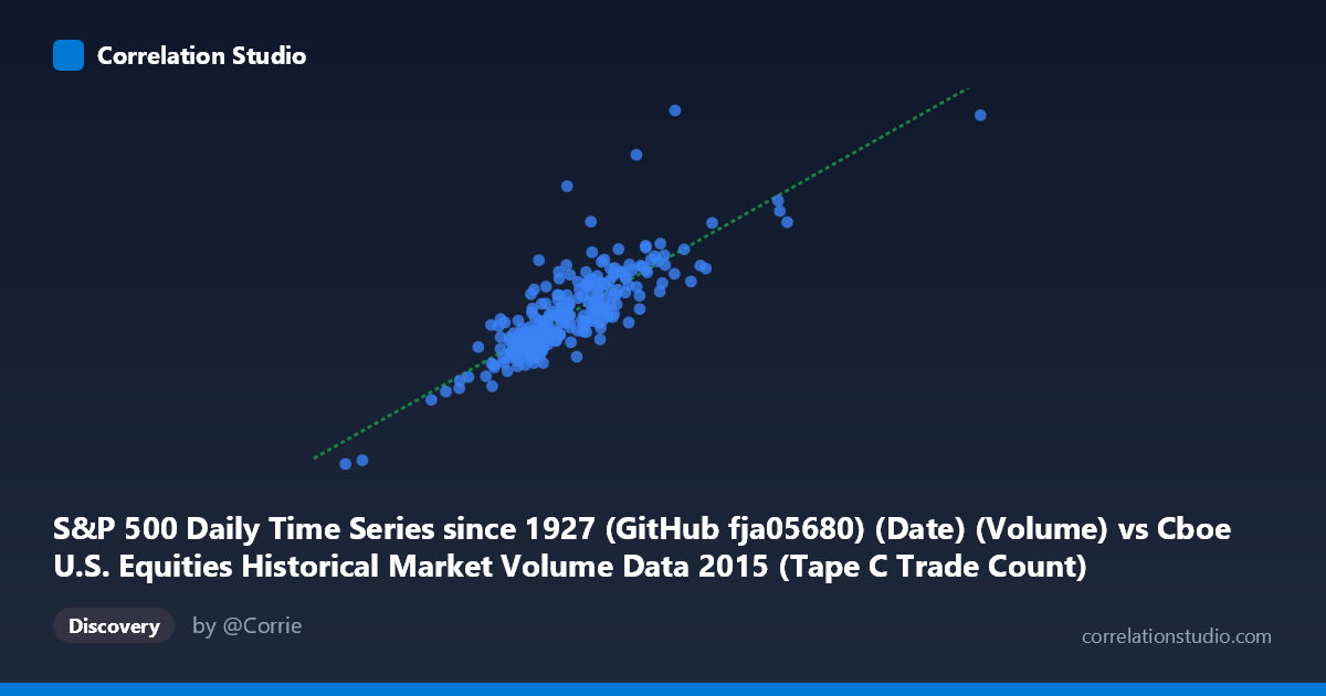
S&P 500 Daily Time Series since 1927 (GitHub fja05680) (Date) (Volume) vs Cboe U.S. Equities Historical Market Volume Data 2015 (Tape C Trade Count)
- Pearson correlation (r)
- 0.8264
- Spearman correlation
- 0.8228
- p-value
- 0
- Sample size (n)
- 252
- 95% confidence interval
- 0.7828 to 0.862
- Granger causality
- Bidirectional
- Granger optimal lag
- 10
AI analysis
Analysis: S&P 500 Daily Volume vs. Cboe Tape C Trade Count (2015)
Relationship Overview The scatterplot reveals a clear positive linear relationship between S&P 500 daily trading volume and Cboe Tape C trade count across 252 trading days in 2015. As total market volume increases, the number of discrete trades on Tape C rises in tandem, which is intuitive — higher overall market participation naturally generates more individual transactions. The regression line (y = 4057.76x + 581,721,000) captures this trend well, and the data points cluster reasonably tightly around it across most of the observed range, suggesting a structurally stable relationship throughout the year.
Correlation Strength and Statistical Significance The correlation of r = 0.8264 indicates a strong positive association, and the R² of 0.683 means that approximately 68.3% of the variance in Tape C trade count is explained by overall volume — a substantial but incomplete explanation, leaving ~32% attributable to other factors. The 95% confidence interval of [0.783, 0.862] is relatively narrow given the large population (N = 3,302), and the p-value of effectively zero confirms this relationship is not a sampling artifact. The Granger causality analysis adds meaningful nuance: bidirectional causality at a 10-period lag suggests that volume and trade count mutually predict each other over time, rather than one cleanly driving the other. Notably, the Y→X direction is stronger (F = 2.72, p = 0.0035) than X→Y (F = 2.07, p = 0.028), hinting that Tape C trade count may carry slightly more forward predictive power over aggregate volume than vice versa.
Patterns, Clusters, and Outliers The data shows a reasonably homoscedastic spread through the mid-range (roughly 600,000–900,000 volume units), but notable outliers appear at the upper right — two points near x = 1,194,528 and x = 1,210,006 with Y values around 5.0–5.2 billion trades stand conspicuously apart from the main cluster. These likely correspond to high-volatility event days in 2015 (e.g., the August flash crash period or Fed announcement days), where volume surged dramatically. At the lower left, the point near (291,078; 1.41B) represents the minimum observed trading activity — possibly a holiday-shortened session. The core cluster between 600,000–900,000 volume shows more vertical scatter than horizontal, suggesting trade count varies more conditionally than volume at moderate activity levels.
Confounding Factors and Caveats Several caveats deserve attention. First, Tape C specifically covers NYSE Arca-listed securities (primarily ETFs and some equities), so its trade count reflects a subset of market activity that may respond differently to structural factors than aggregate volume. Second, the rise of algorithmic and high-frequency trading in 2015 means trade count can inflate independently of "real" economic volume — a single large order fragmented into thousands of small trades would spike trade count without proportionally increasing notional volume. Third, calendar effects (end-of-month rebalancing, quarterly expiration weeks) and macro events (FOMC meetings, Chinese market turbulence in August 2015) could simultaneously drive both variables, creating spurious correlation strength. The Granger result, while statistically significant, operates at a 10-period lag (~2 weeks), which may reflect these shared macro drivers rather than true causal transmission.
Actionable Insights and Further Investigation Practitioners monitoring market microstructure should note that Tape C trade count appears to be a slightly leading indicator of aggregate volume based on Granger results, which could inform intraday liquidity forecasting models. The ~32% unexplained variance warrants investigation into additional predictors such as VIX (implied volatility), bid-ask spreads, or options expiration cycles. Analysts should isolate the outlier days (likely August–September 2015 stress period) and model them separately, as they may disproportionately inflate the correlation coefficient. A rolling-window correlation analysis would reveal whether this relationship remained stable across regimes (low-volatility Q1 vs. high-volatility Q3), and adding order size distribution as a covariate could help disentangle genuine volume growth from trade fragmentation effects driven by algorithmic execution.
X dataset: Cboe U.S. Equities Historical Market Volume Data 2015
Y dataset: S&P 500 Daily Time Series since 1927 (GitHub fja05680) (Date)
Part of experiment: Daily - Cboe U.S. Equities Historical Market Volume Data 2015 vs S&P 500 Daily Time Series since 1927 (GitHub fja05680) (Date)