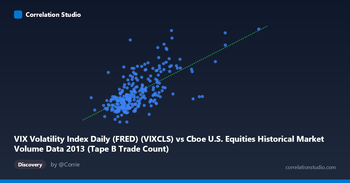
VIX Volatility Index Daily (FRED) (VIXCLS) vs Cboe U.S. Equities Historical Market Volume Data 2013 (Tape B Trade Count)
- Pearson correlation (r)
- 0.6546
- Spearman correlation
- 0.6284
- p-value
- 0
- Sample size (n)
- 252
- 95% confidence interval
- 0.5778 to 0.72
- Granger causality
- None
- Granger optimal lag
- 1
AI analysis
Analysis: VIX Volatility Index vs. Tape B Trade Count (2013)
Relationship Overview The scatterplot reveals a moderately positive relationship between the VIX Volatility Index and Cboe Tape B Trade Count across 252 trading days in 2013. As the VIX rises — indicating greater implied volatility and market fear — the number of Tape B trades tends to increase correspondingly. This is intuitively sensible: periods of elevated market uncertainty typically drive higher trading activity as investors reposition, hedge, or react to news. The linear regression equation (y = 2.57×10⁻⁵x + 9.75) suggests that for every unit increase in daily market volume (X), the VIX adds approximately 0.0000257 points, though the practical interpretation flows more naturally in the reverse framing — higher VIX days coincide with meaningfully elevated trade counts.
Correlation Strength and Statistical Significance The Pearson correlation of r = 0.6546 indicates a moderate-to-strong positive association, and the R² of 0.4286 means that roughly 42.9% of the variance in Tape B Trade Count is explained by VIX levels — a substantively meaningful but far from complete explanation, leaving ~57% attributable to other factors. The 95% confidence interval of [0.5778, 0.7200] is reassuringly tight, reflecting the large sample (N = 3,780; n = 252), and the p-value of effectively zero confirms this relationship is extremely unlikely to be due to chance. However, the Granger causality results are notably uninformative: neither direction (X→Y: F = 0.13, p = 0.71; Y→X: F = 0.15, p = 0.70) reaches significance at any conventional threshold, meaning that past values of VIX do not reliably predict future Tape B counts, and vice versa. The correlation is contemporaneous rather than predictive — both variables appear to move together in response to shared underlying forces rather than one leading the other.
Notable Patterns, Clusters, and Outliers The sample points reveal several distinct features worth flagging. The bulk of observations cluster in the VIX range of ~130,000–200,000 with Y values of 12–15, forming a dense core that anchors the regression. However, there is a visible upper-right dispersion where higher VIX readings (200,000–330,000+) correspond to elevated trade counts in the 16–20 range, stretching the relationship. Several potential outliers stand out: the point at approximately (241,064, 20.34) sits well above the regression line, as does (412,035, ~20.49) implied by the X-range maximum. The point at (327,004, 17.27) also appears in a sparsely populated high-volume region. These extreme observations may disproportionately influence the regression slope and warrant individual examination.
Confounding Factors and Caveats Several important caveats temper this analysis. First, reverse causality is plausible: high trade volume itself can signal market stress, potentially driving VIX higher rather than the other way around — and the Granger tests confirm no clean directional story. Second, omitted variables such as macroeconomic announcements (FOMC meetings, payroll reports), earnings seasons, or geopolitical events in 2013 (e.g., the Federal Reserve's taper tantrum in May–June) likely drive both VIX spikes and volume surges simultaneously, creating a spurious or inflated correlation. Third, Tape B specifically covers NYSE American and regional exchanges, so it may not be fully representative of total market activity, introducing a selection bias. Finally, the data covers only one calendar year (2013), a period of generally low-to-moderate volatility with a few notable spikes, which may not generalize to other market regimes.
Actionable Insights and Further Investigation For practitioners, the contemporaneous correlation — while not predictive — suggests that real-time VIX monitoring can serve as a useful signal for expected Tape B trading intensity on the same day, which has operational value for exchange capacity planning and liquidity provision. Further investigation should include: (1) extending the time series beyond 2013 to test whether this relationship holds across different volatility regimes (e.g., 2020 COVID shock); (2) applying non-linear models (e.g., polynomial regression or spline fitting), as the upper-tail behavior suggests the relationship may accelerate at high VIX levels; (3) controlling for macro event calendars to isolate the true VIX-volume relationship from announcement effects; and (4) comparing Tape A, B, and C trade counts separately to determine whether this dynamic is unique to regional exchanges or market-wide. Examining intraday data could also reveal whether the Granger causality picture changes at finer temporal resolution.
X dataset: Cboe U.S. Equities Historical Market Volume Data 2013
Y dataset: VIX Volatility Index Daily (FRED)
Part of experiment: Daily - Cboe U.S. Equities Historical Market Volume Data 2013 vs VIX Volatility Index Daily (FRED)