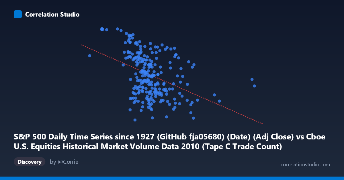
S&P 500 Daily Time Series since 1927 (GitHub fja05680) (Date) (Adj Close) vs Cboe U.S. Equities Historical Market Volume Data 2010 (Tape C Trade Count)
- Pearson correlation (r)
- -0.4171
- Spearman correlation
- -0.4181
- p-value
- 0
- Sample size (n)
- 252
- 95% confidence interval
- -0.5141 to -0.3094
- Granger causality
- Y → X
- Granger optimal lag
- 1
AI analysis
Analysis: S&P 500 Adjusted Close vs. Cboe Tape C Trade Count (2010)
Relationship Overview The scatterplot reveals a moderate negative relationship between S&P 500 adjusted closing prices (X-axis) and Cboe Tape C trade counts (Y-axis) across 2010 trading days. As equity prices rose throughout the year, the number of trades recorded on Tape C (NYSE-listed securities traded off-exchange or on regional venues) tended to decline. The linear regression equation (y = -0.000154551x + 1,235.08) quantifies this inverse slope, suggesting that for every 100,000-unit increase in the S&P 500 adjusted close, Tape C trade counts fell by roughly 15–16 units. Visually, the data forms a broadly downward-sloping cloud, though with considerable dispersion around the trend line, indicating the relationship is real but far from deterministic.
Correlation Strength and Statistical Significance The Pearson correlation of r = -0.4171 indicates a moderate negative association, but the explanatory power is modest: R² = 0.1739, meaning only about 17.4% of the variance in Tape C trade counts is explained by S&P 500 price levels alone. The remaining ~82.6% is attributable to other factors entirely. The 95% confidence interval of [-0.5141, -0.3094] is comfortably negative and does not include zero, and the p-value of 5.02 × 10⁻¹² confirms this association is highly statistically significant across the N = 3,302 population, making chance an implausible explanation. Critically, the Granger causality analysis points to a unidirectional temporal relationship: Y Granger-causes X (F = 4.2982, p = 0.0392), while X→Y falls short of significance (F = 1.8698, p = 0.1727). This means Tape C trade counts have modest predictive power for next-period S&P 500 price movements, but not the reverse — a counterintuitive but practically meaningful finding suggesting that off-exchange trading activity may serve as a leading indicator of price direction.
Notable Patterns, Clusters, and Outliers Several structural features are visible in the data. The bulk of observations cluster in the X range of roughly 450,000–750,000, where trade counts span the full Y range (~1,050–1,260), contributing most of the variance. At higher price values (X 900,000), observations thin out considerably and trade counts converge toward the lower end (~1,060–1,140), consistent with the negative trend. A few notable outliers warrant attention: the point at (1,379,286.67, 1,110.88) is a clear high-leverage outlier on the X-axis — an unusually elevated S&P price observation that sits far from the main cluster. Similarly, points like (298,429.00, 1,256.77) and (377,050.27, 1,258.84) represent the high-trade-count, low-price extreme. These boundary observations likely correspond to specific early- and late-year trading days and anchor the negative slope disproportionately. There is also a hint of heteroscedasticity: the spread in trade counts appears wider at lower price values and narrows as prices increase.
Confounding Factors and Interpretive Caveats Several important caveats apply. First, this correlation is substantially temporal in nature — the S&P 500 broadly trended upward through 2010 while market microstructure evolved, so the negative correlation may largely reflect co-trending over time rather than a direct causal mechanism. Second, Tape C trade volume is influenced by regulatory changes, exchange fee structures, and algorithmic trading behavior that are entirely independent of price levels. Third, the Granger causality result, while statistically significant, uses only a 1-period lag — the economic magnitude is modest, and Granger causality does not imply true structural causation. Fourth, the sample covers a single calendar year (2010), a period of post-crisis recovery with idiosyncratic volatility patterns, limiting generalizability. Finally, the dataset spans N = 3,302 underlying observations but the scatterplot uses n = 252 paired samples, so some information compression has occurred.
Actionable Insights and Further Investigation The Granger causality finding — that Tape C trade counts lead S&P 500 prices — is the most actionable result here and merits deeper investigation. Analysts should examine whether this predictive relationship holds across multiple years and market regimes, or whether it is specific to the 2010 recovery environment. It would be valuable to decompose the temporal trend from the cross-sectional relationship by detrending both series or using first differences to isolate day-to-day co-movements. Further analysis should incorporate other tape categories (A and B) and total market volume to determine whether Tape C specifically carries the signal or whether it proxies broader off-exchange activity. Finally, regime-based segmentation — separating high-volatility from low-volatility periods — could reveal whether the negative correlation strengthens during stress events, which would have implications for using trade count data as a real-time market sentiment indicator.
X dataset: Cboe U.S. Equities Historical Market Volume Data 2010
Y dataset: S&P 500 Daily Time Series since 1927 (GitHub fja05680) (Date)
Part of experiment: Daily - Cboe U.S. Equities Historical Market Volume Data 2010 vs S&P 500 Daily Time Series since 1927 (GitHub fja05680) (Date)