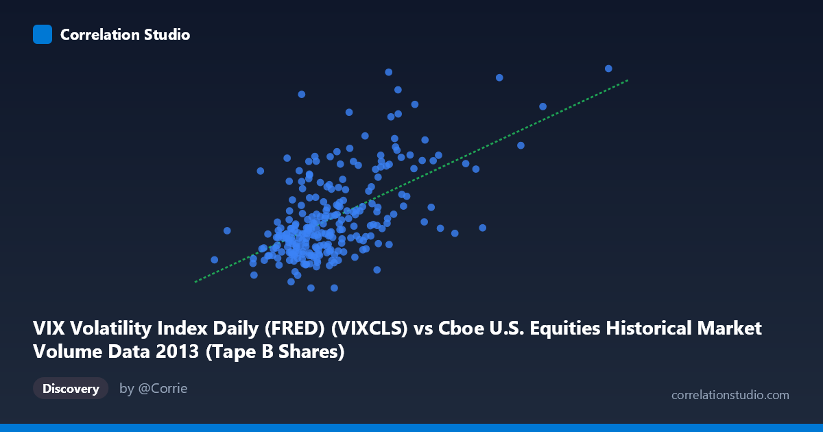
VIX Volatility Index Daily (FRED) (VIXCLS) vs Cboe U.S. Equities Historical Market Volume Data 2013 (Tape B Shares)
- Pearson correlation (r)
- 0.5831
- Spearman correlation
- 0.5179
- p-value
- 0
- Sample size (n)
- 252
- 95% confidence interval
- 0.4952 to 0.6592
- Granger causality
- None
- Granger optimal lag
- 1
AI analysis
Scatterplot Analysis: VIX Volatility Index vs. Tape B Share Volume (2013)
Relationship Overview
The scatterplot reveals a moderate positive relationship between Cboe U.S. Equities market volume (Tape B Shares, on the Y-axis) and the VIX Volatility Index (on the X-axis) across 252 trading days in 2013. As daily market volume increases, VIX readings tend to rise correspondingly — a relationship that is visually apparent as an upward-sloping cloud of points. This aligns with well-established market intuition: heightened trading activity in U.S. equities is frequently accompanied by elevated implied volatility, as investors hedge positions or react to market uncertainty. The linear regression equation (y = 5.717×10⁻⁸x + 10.19) captures this trend, though the scatter around the line is considerable.
Correlation Strength and Statistical Significance
The Pearson correlation of r = 0.583 indicates a moderate positive association, and the R² of 0.340 means that roughly 34% of the variance in VIX is explained by Tape B share volume — leaving 66% attributable to other factors. The 95% confidence interval for r of [0.495, 0.659] is relatively tight and does not include zero, and with a p-value effectively at 0 (across a population of N = 3,780), the relationship is highly statistically significant and unlikely to be a sampling artifact. However, statistical significance should not be conflated with practical magnitude — a third of variance explained is meaningful but far from deterministic. Critically, the Granger causality tests show no significant temporal predictive direction in either direction (X→Y: F = 0.58, p = 0.447; Y→X: F = 0.28, p = 0.598). This means that knowing yesterday's volume does not help predict today's VIX, and vice versa — the two variables move together contemporaneously rather than one leading the other, cautioning strongly against any causal interpretation.
Notable Patterns, Clusters, and Outliers
The point cloud shows a dense core concentration between roughly 55–80 million shares (X) and VIX values of 12–16, consistent with the dataset's mean volume of ~70.6M and mean VIX of ~14.23. This central cluster suggests a relatively stable, low-volatility regime dominated most of 2013. However, several notable outliers are visible at the upper extremes: points near X = 89–90M shares with VIX approaching 20.34, and a point near X = 135M shares with VIX ~17.27, suggest episodic spikes — likely corresponding to specific market stress events (e.g., the May–June 2013 taper tantrum period). There also appear to be points with high volume but moderate VIX (e.g., ~119M shares at VIX ~16.28), suggesting volume can surge without proportionate fear gauge elevation. The distribution is right-skewed on the X-axis, with most volume observations clustering below 90M but a long tail extending to ~165M.
Confounding Factors and Caveats
Several important caveats apply. First, reverse causality is plausible — VIX rising may itself induce volume as market participants react, yet the Granger test rules out a clean lagged directional relationship, suggesting both may be driven by a common third factor (e.g., macroeconomic news, Fed announcements, geopolitical events). Second, the data covers only one calendar year (2013), a period of generally low volatility and a strong bull market — results may not generalize to other regimes, particularly high-stress periods like 2008 or 2020. Third, Tape B specifically (NYSE American/regional exchanges) may not fully represent broader market dynamics captured by VIX, which is anchored to S&P 500 options. Fourth, the daily aggregation smooths intraday dynamics that could reveal richer relationships. Finally, seasonal patterns in trading volume (e.g., lower summer/holiday volume) could be a structural confounder inflating the apparent correlation.
Actionable Insights and Further Investigation
Practitioners monitoring market microstructure should treat elevated Tape B volume as a contemporaneous signal of rising implied volatility, useful for same-day risk assessment but not as a predictive lead indicator. For further investigation, it would be valuable to: (1) expand the time series across multiple years and volatility regimes to test whether the r ≈ 0.58 relationship is stable or regime-dependent; (2) decompose volume by trade type (institutional block trades vs. retail) to identify which participant behavior drives the VIX co-movement; (3) test non-linear models (e.g., spline or threshold regression), as the outlier cluster above VIX ~18 suggests the relationship may steepen during stress episodes; and (4) include additional covariates such as S&P 500 returns, bid-ask spreads, or news sentiment indices to build a more complete explanatory model and reduce the unexplained 66% of VIX variance.
X dataset: Cboe U.S. Equities Historical Market Volume Data 2013
Y dataset: VIX Volatility Index Daily (FRED)
Part of experiment: Daily - Cboe U.S. Equities Historical Market Volume Data 2013 vs VIX Volatility Index Daily (FRED)