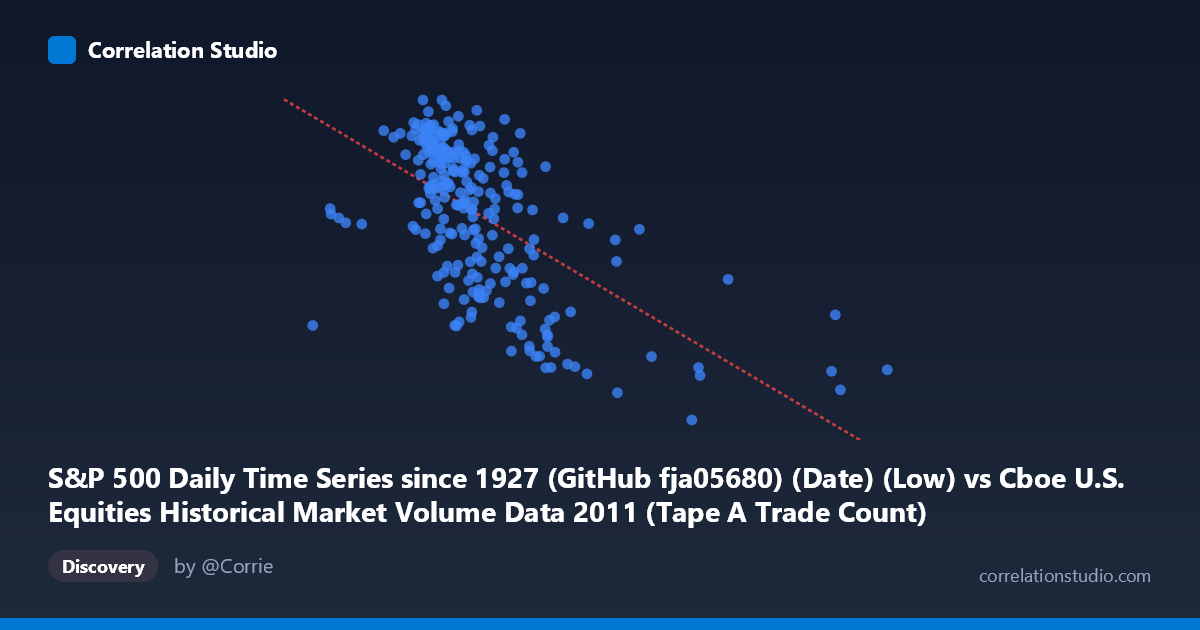
S&P 500 Daily Time Series since 1927 (GitHub fja05680) (Date) (Low) vs Cboe U.S. Equities Historical Market Volume Data 2011 (Tape A Trade Count)
- Pearson correlation (r)
- -0.5928
- Spearman correlation
- -0.6016
- p-value
- 0
- Sample size (n)
- 252
- 95% confidence interval
- -0.6675 to -0.5063
- Granger causality
- None
- Granger optimal lag
- 1
AI analysis
Analysis: S&P 500 Daily Low vs. Cboe Tape A Trade Count (2011)
Relationship Overview The scatterplot reveals a negative relationship between the S&P 500 daily low price (X-axis) and the Cboe Tape A trade count (Y-axis) over the course of 2011. As the S&P 500 daily low values increase, trade counts tend to decrease. This inverse pattern is intuitive in a market context: higher index price levels in 2011 generally corresponded to calmer, more confident market conditions with lower trading frequency, while lower index levels — particularly during the market stress periods of mid-to-late 2011 — were associated with elevated trading activity driven by volatility and uncertainty.
Correlation Strength and Statistical Significance The Pearson correlation of r = -0.5928 indicates a moderate-to-strong negative association, and with a p-value effectively at zero and a tight 95% confidence interval of [-0.6675, -0.5063], this result is statistically robust across the sample of 252 paired observations drawn from a population of 3,780. However, the R² of 0.3514 means that S&P 500 daily lows explain only about 35% of the variance in Tape A trade counts — leaving roughly 65% of the variation attributable to other factors. The linear regression equation (y = -0.000124x + 1405.32) confirms the negative slope is meaningful but modest in predictive power. Critically, the Granger causality tests show no significant temporal predictive relationship in either direction (X→Y: F=0.0017, p=0.97; Y→X: F=0.137, p=0.71), meaning that knowing yesterday's index low does not help predict today's trade count, and vice versa. The correlation is contemporaneous rather than predictive.
Notable Patterns, Clusters, and Outliers Several structural features stand out in the data. There is a visible cluster of high trade counts (above ~1,300) concentrated in the lower X range (~900,000–1,100,000), corresponding to the August–October 2011 market downturn when the S&P 500 fell sharply amid the U.S. debt ceiling crisis and European sovereign debt fears. Conversely, lower trade counts cluster at higher X values, consistent with the relatively quieter first-half of 2011. A handful of notable outliers appear at very high X values (e.g., points near 1,876,000, 2,126,000, and 2,925,000), which likely represent data anomalies, index reconstitution events, or cross-listed volume artifacts. The point at approximately (2,126,542, 1,121) is particularly distant from the main cluster and may warrant individual inspection. The relationship also appears to have mild non-linearity, with trade counts plateauing or compressing at higher index levels, suggesting diminishing returns in the linear model's fit at the extremes.
Confounding Factors and Caveats Several important caveats apply. First, 2011 was a structurally unusual year — the August debt-ceiling crisis and European contagion fears created regime-specific volatility spikes that may not generalize to other periods, making this correlation partly an artifact of a single macro episode rather than a stable structural relationship. Second, Tape A trade counts capture only NYSE-listed securities, while the S&P 500 index low reflects a broader multi-exchange universe, introducing a scope mismatch. Third, the directionality of the dataset labels appears swapped in the metadata (each column is listed under the other's dataset name), which warrants verification before drawing firm conclusions. Fourth, secular trends — such as the overall decline in trading volumes throughout 2011 as high-frequency trading activity shifted — could be acting as a common driver of both variables, producing a spurious or partially spurious correlation.
Actionable Insights and Further Investigation Given the moderate explanatory power but absence of Granger causality, this correlation is best understood as a coincident market stress indicator rather than a trading signal. Practitioners could explore incorporating the S&P 500 low as one feature within a broader regime-detection model that flags high-volatility periods associated with elevated trade counts. Further investigation should include: (1) controlling for the VIX to determine whether implied volatility subsumes the index-level effect on trade counts; (2) extending the analysis across multiple years to test whether the 2011 pattern holds in different market regimes; (3) examining non-linear models (e.g., piecewise regression with a breakpoint around the August 2011 drawdown) to better capture the apparent threshold behavior; and (4) investigating the extreme high-X outliers to determine whether they reflect data quality issues or genuine market microstructure events.
X dataset: Cboe U.S. Equities Historical Market Volume Data 2011
Y dataset: S&P 500 Daily Time Series since 1927 (GitHub fja05680) (Date)
Part of experiment: Daily - Cboe U.S. Equities Historical Market Volume Data 2011 vs S&P 500 Daily Time Series since 1927 (GitHub fja05680) (Date)