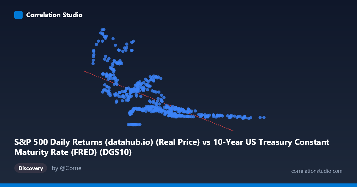
S&P 500 Daily Returns (datahub.io) (Real Price) vs 10-Year US Treasury Constant Maturity Rate (FRED) (DGS10)
- Pearson correlation (r)
- -0.6488
- Spearman correlation
- -0.7146
- p-value
- 0
- Sample size (n)
- 493
- 95% confidence interval
- -0.6971 to -0.5945
- Granger causality
- Bidirectional
- Granger optimal lag
- 10
AI analysis
Analysis: 10-Year Treasury Yield vs. S&P 500 Price
Relationship Overview The scatterplot reveals a negative relationship between the 10-year US Treasury constant maturity rate (X-axis) and the S&P 500 real price level (Y-axis), captured by the regression equation y = -244.61x + 2853.77. As Treasury yields rise, S&P 500 price levels tend to decline, and vice versa. This is consistent with well-established financial theory: higher risk-free rates increase discount rates applied to future equity cash flows, mechanically compressing present valuations. The relationship is visually apparent across the scatterplot, though with considerable dispersion — particularly at lower yield values (X < 4), where S&P 500 prices span an enormous range from near zero to above 4,500, suggesting the relationship is far from deterministic.
Correlation Strength and Statistical Significance The Pearson correlation of r = -0.6488 indicates a moderate-to-strong negative association, but the more informative metric is r² = 0.4209, meaning Treasury yields explain only about 42% of the variance in S&P 500 prices. The remaining 58% is driven by other forces entirely. The 95% confidence interval of [-0.697, -0.595] is reassuringly narrow given n = 493 paired observations from a population of N = 1,865, and the p-value of effectively zero confirms the correlation is not a sampling artifact. Granger causality testing reveals a bidirectional relationship at a 10-period optimal lag: Y→X is the stronger direction (F = 4.19, p ≈ 0.000), suggesting S&P 500 price movements have historically been better temporal predictors of subsequent Treasury yield changes than the reverse (X→Y: F = 2.26, p = 0.014), though both directions are statistically significant. This bidirectionality cautions against assuming a simple one-way causal narrative.
Notable Patterns, Clusters, and Outliers Several structural features stand out. There is a dense cluster between yields of 4–9% with S&P 500 prices predominantly below 2,000, likely corresponding to the high-rate environment of the 1970s–1990s. A second cluster emerges at very low yields (0.6–3%) with dramatically higher S&P 500 prices (2,000–5,140), reflecting the post-2009 and post-2020 zero-interest-rate policy era. The point (4.77, 0.00) is a clear outlier — a zero S&P 500 price value that likely reflects a data artifact or preprocessing error and warrants investigation. Points like (1.48, 4937), (2.39, 4650), and (0.66, 3687) represent the recent ultra-low-rate, high-equity-price environment and exert significant leverage on the regression line. The relationship also appears nonlinear, with prices rising sharply as yields approach zero, suggesting a hyperbolic or inverse functional form may fit better than the linear model.
Confounding Factors and Caveats This correlation spans over six decades (1962–2026), during which the economic regime changed dramatically — including the Bretton Woods era, the Volcker rate shock, the Great Moderation, quantitative easing, and COVID-era fiscal expansion. Secular trends in both series (declining rates and rising equity prices from the 1980s to 2020s) likely inflate the apparent correlation through shared time trends rather than a direct causal mechanism. Corporate earnings growth, inflation regimes, geopolitical events, Fed policy expectations, and equity risk premiums all independently drive S&P 500 valuations. The monthly S&P 500 series matched against a daily Treasury yield series also introduces temporal misalignment. Furthermore, the bidirectional Granger causality suggests feedback loops rather than clean causation — rising equity prices may signal economic strength that prompts rate increases, creating reverse causality.
Actionable Insights and Further Investigation Practitioners should avoid treating this as a stable trading rule: the regime-dependence of the relationship means it may break down in stagflationary environments (where both rates and equities can fall together, as in 2022). A regime-segmented analysis — splitting the sample into rising-rate and falling-rate eras — would likely reveal structurally different correlations. Fitting a nonlinear model (e.g., inverse or log-linear) should be tested given the visual curvature. The strong Y→X Granger direction suggests S&P 500 performance may be a useful leading indicator for Treasury yield forecasting, worth incorporating into fixed income models. Finally, the outlier at Y = 0.00 should be removed or investigated before drawing further conclusions, as it may distort regression estimates.
X dataset: 10-Year US Treasury Constant Maturity Rate (FRED)
Y dataset: S&P 500 Daily Returns (datahub.io)
Part of experiment: Daily - 10-Year US Treasury Constant Maturity Rate (FRED) vs S&P 500 Daily Returns (datahub.io)