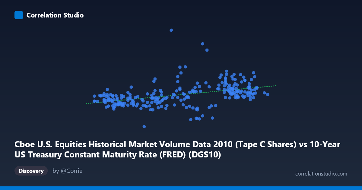
Cboe U.S. Equities Historical Market Volume Data 2010 (Tape C Shares) vs 10-Year US Treasury Constant Maturity Rate (FRED) (DGS10)
- Pearson correlation (r)
- 0.4188
- Spearman correlation
- 0.5358
- p-value
- 0
- Sample size (n)
- 250
- 95% confidence interval
- 0.3109 to 0.5161
- Granger causality
- None
- Granger optimal lag
- 10
AI analysis
Scatterplot Analysis: 10-Year Treasury Yield vs. Cboe Equity Market Volume (2010)
1. Overall Relationship Revealed by the Visualization
The scatterplot depicts the relationship between the 10-year US Treasury constant maturity yield (X-axis) and Cboe U.S. equity market volume in shares (Y-axis) across 250 trading days sampled from 2010. The linear regression line (y = 40,873,000x + 38,911,300) has a positive slope, indicating that higher Treasury yields tend to coincide with higher equity trading volumes during this period. However, the visual scatter around that line is substantial — data points are widely dispersed across the full X range of roughly 2.41% to 4.01%, with Y values spanning from approximately 42 million to over 428 million shares. This wide dispersion immediately signals that the linear relationship, while present, leaves much of the story untold.
2. Correlation Strength, Direction, and Statistical Context
The Pearson correlation of r = 0.4188 indicates a modest positive relationship, but the more meaningful figure is r² = 0.1754: only about 17.5% of the variance in equity volume is explained by Treasury yield levels. The remaining 82.5% is attributable to other factors entirely. The 95% confidence interval of [0.31, 0.52] is reasonably tight given N = 3,302 (the full population), and the p-value of 4.875×10⁻¹² confirms the correlation is highly statistically significant — effectively ruling out a chance finding. That said, statistical significance here is partly a function of large sample size, so practical significance deserves separate scrutiny. Crucially, Granger causality analysis finds no significant directional predictive relationship in either direction (X→Y: F = 1.64, p = 0.098; Y→X: F = 1.27, p = 0.252). Neither variable reliably predicts the other's future values at the optimal 10-period lag, which means that even the modest correlation observed should not be interpreted as evidence that Treasury yields drive volume decisions, or vice versa, in a temporal sense.
3. Notable Patterns, Clusters, and Outliers
Several features warrant attention. First, the data exhibits a notable concentration of points in the 3.0–3.9% yield range, which reflects the actual distribution of 10-year rates during 2010 (rates were broadly in decline from ~3.9% early in the year toward ~2.4% by December amid post-crisis monetary accommodation). Second, there is a stark outlier at approximately (3.12, 428,533,843) — a single day with extraordinary volume nearly double any comparable observation at similar yield levels. This point alone could meaningfully inflate both the slope and the Pearson r, and its influence on the regression should be tested explicitly. Third, at the lower yield end (X < 2.7%), volume values cluster in a narrower band around 120–180 million shares, while higher yields (X 3.5%) show considerably more vertical spread, potentially indicating heteroscedasticity. Additionally, the note that Spearman ρ exceeds Pearson r is an important signal: the monotonic rank-order relationship is stronger than the linear one, suggesting a non-linear (possibly logarithmic or polynomial) functional form may better characterize this association.
4. Confounding Factors and Interpretive Caveats
Several confounders complicate a straightforward causal interpretation. First, 2010 was a structurally unique year — markets were recovering from the 2008–09 financial crisis, the Federal Reserve was conducting unconventional monetary policy (QE2 was announced in November 2010), and high-frequency trading was expanding rapidly, all of which independently affected both yields and volume. Second, Treasury yields in 2010 were themselves driven by macro factors (economic data surprises, Fed communication, European sovereign debt fears) that simultaneously affected equity market risk appetite and trading activity — classic confounding. Third, the axis label mismatch in the metadata (the X-axis column is listed under a Cboe dataset while the Y-axis column is listed under a FRED dataset) deserves verification; if columns were inadvertently swapped during data joining, the directional interpretation would be reversed. Fourth, volume data aggregated at the Tape C level may not fully represent total equity market activity, potentially introducing selection bias in the volume measure.
5. Actionable Insights and Further Investigation
Given the modest explained variance and absent Granger causality, practitioners should resist using daily Treasury yield levels as a standalone predictor of equity market volume. However, several follow-up analyses are warranted. First, re-run the regression after removing or Winsorizing the extreme outlier (~428M shares) to quantify its leverage on r and the slope. Second, fit polynomial and logarithmic models and compare AIC/BIC, given the Spearman Pearson signal. Third, examine yield changes (Δy) rather than yield levels as the X-variable — daily yield moves may better capture the uncertainty or "news shock" environment that drives traders to act. Fourth, incorporate a volatility control (e.g., VIX levels) as a mediating or confounding variable, since both yield volatility and volume spikes are likely driven by the same underlying uncertainty regime. Finally, extending this analysis to multiple years would clarify whether the 2010 positive correlation is a persistent structural feature or an artifact of the specific macro-policy environment of that calendar year.
X dataset: 10-Year US Treasury Constant Maturity Rate (FRED)
Y dataset: Cboe U.S. Equities Historical Market Volume Data 2010
Part of experiment: Daily - 10-Year US Treasury Constant Maturity Rate (FRED) vs Cboe U.S. Equities Historical Market Volume Data 2010