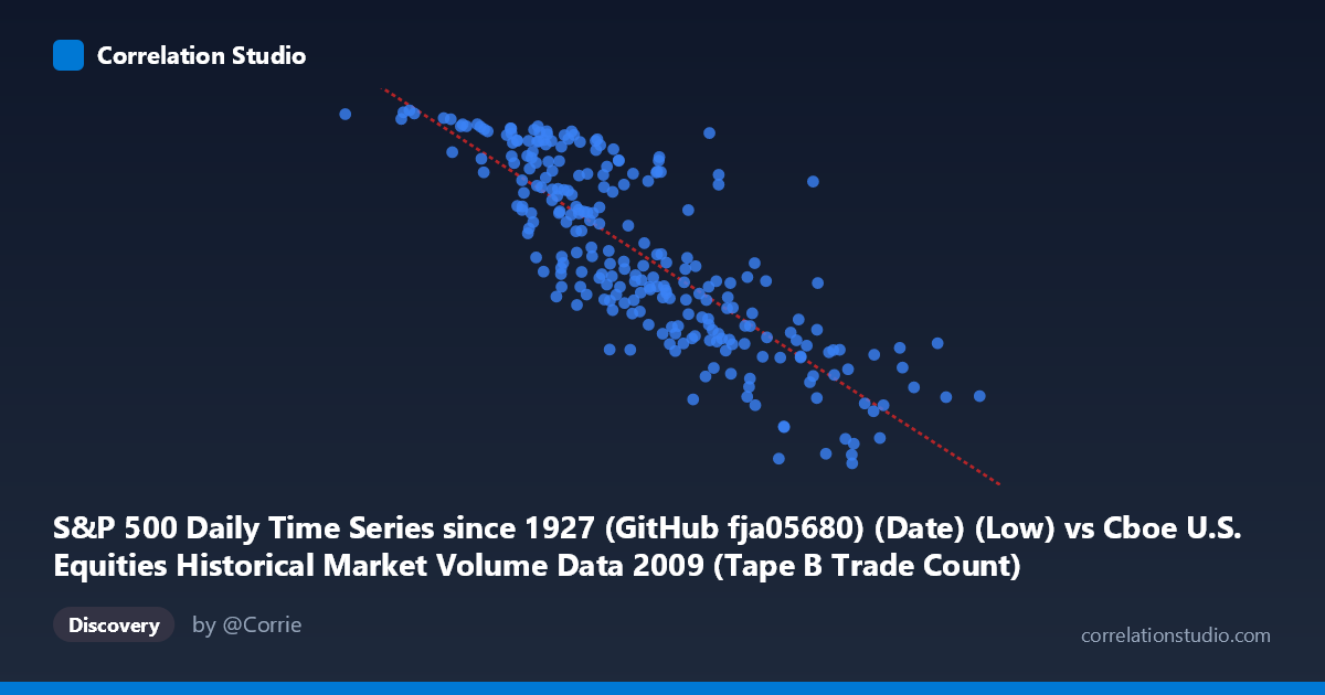
S&P 500 Daily Time Series since 1927 (GitHub fja05680) (Date) (Low) vs Cboe U.S. Equities Historical Market Volume Data 2009 (Tape B Trade Count)
- Pearson correlation (r)
- -0.8201
- Spearman correlation
- -0.8317
- p-value
- 0
- Sample size (n)
- 252
- 95% confidence interval
- -0.8569 to -0.7751
- Granger causality
- Bidirectional
- Granger optimal lag
- 10
AI analysis
Analysis: S&P 500 Daily Low vs. Cboe Tape B Trade Count (2009)
Relationship Overview The scatterplot reveals a clear negative relationship between the S&P 500 daily low price and the Cboe Tape B trade count throughout 2009. As the index's daily low rises, trade counts on Tape B (mid-cap and regional exchange-listed securities) tend to decline meaningfully. This inverse pattern makes intuitive sense in the context of 2009's market narrative: the year began in the depths of the financial crisis, when prices were depressed but trading activity — driven by panic selling, forced liquidations, and high-frequency opportunism — was extremely elevated. As prices recovered across the year, market anxiety subsided and speculative trading volume normalized downward.
Correlation Strength and Statistical Robustness The Pearson correlation of r = −0.82 is strong, and the coefficient of determination R² = 0.6726 tells us that roughly 67.3% of the variance in Tape B trade count is explained by the S&P 500 daily low, a substantial explanatory share for daily financial data. The linear regression slope of approximately −0.000774 trades per unit increase in the index low quantifies this decline concretely. The 95% confidence interval [−0.857, −0.775] is narrow and does not approach zero, and the p-value is effectively 0, confirming this is not a sampling artifact. The Granger causality results add an important temporal dimension: bidirectional causality is detected at a 10-period lag (X→Y: F = 2.21, p = 0.019; Y→X: F = 2.20, p = 0.019), meaning neither variable is a clean one-way driver — past price levels help predict future trade counts, but past trade counts also help predict future price lows. This symmetry suggests a feedback loop rather than a simple causal chain, and both F-statistics are only modestly above significance thresholds, so the predictive edges are real but not overwhelming.
Patterns, Clusters, and Outliers The sample points reveal natural clustering by market regime. A dense cluster of high trade counts (900–1,100+) pairs with low index values (roughly 80,000–350,000 on the x-axis, reflecting early-2009 crisis lows), while a second cluster of lower trade counts (700–900) maps to higher index levels in the second half of 2009 as markets recovered. A few notable outliers are visible: the point near (81,703, 1,121) represents an extreme low-price, high-volume session — likely near the March 2009 market bottom — while (766,764, 754) anchors the opposite end, reflecting a late-year high-price, low-volume session. Some scatter around the regression line in the mid-range (400,000–550,000) suggests the relationship is not perfectly linear and that other dynamics were at play during transitional periods.
Confounds and Caveats Several confounding factors warrant caution. Time is the hidden variable here: both price and trade counts are driven by the shared 2009 market timeline, so this correlation may largely reflect the passage from crisis conditions to recovery rather than a direct structural link between price level and Tape B activity specifically. Secular trends in algorithmic and high-frequency trading during 2009 could inflate trade counts independently of price. Additionally, Tape B covers a specific subset of securities (NYSE MKT/AMEX-listed), so this relationship may not generalize to Tape A or Tape C markets. The bidirectional Granger causality with a 10-period lag also implies that the data has meaningful autocorrelation structure — violating OLS assumptions of independence — which means standard p-values may be slightly optimistic.
Actionable Insights and Further Investigation Practitioners and researchers should consider decomposing this time series to separate the trend component (driven by the 2009 recovery arc) from residual correlation to test whether a price-volume inverse relationship holds after detrending. It would be valuable to compare Tape B against Tape A and Tape C trade counts to determine whether this dynamic is specific to mid-cap or regional listings. Given the bidirectional Granger result, a Vector Autoregression (VAR) model at the 10-period lag would better capture the feedback dynamics than linear regression alone. Finally, extending the analysis to other crisis-recovery years (e.g., 2020) could test whether this inverse price-volume relationship is a generalizable market stress signature or a feature unique to 2009's particular trajectory.
X dataset: Cboe U.S. Equities Historical Market Volume Data 2009
Y dataset: S&P 500 Daily Time Series since 1927 (GitHub fja05680) (Date)
Part of experiment: Daily - Cboe U.S. Equities Historical Market Volume Data 2009 vs S&P 500 Daily Time Series since 1927 (GitHub fja05680) (Date)