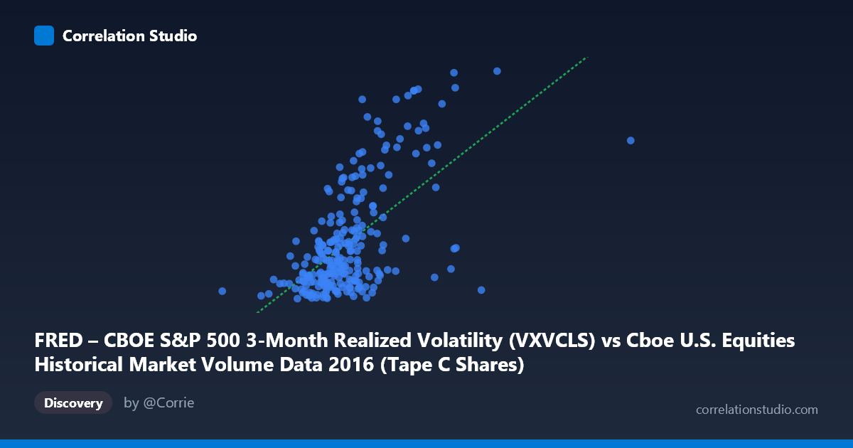
FRED – CBOE S&P 500 3-Month Realized Volatility (VXVCLS) vs Cboe U.S. Equities Historical Market Volume Data 2016 (Tape C Shares)
- Pearson correlation (r)
- 0.6021
- Spearman correlation
- 0.5473
- p-value
- 0
- Sample size (n)
- 252
- 95% confidence interval
- 0.517 to 0.6755
- Granger causality
- None
- Granger optimal lag
- 1
AI analysis
Scatterplot Analysis: CBOE S&P 500 3-Month Realized Volatility vs. Tape C Shares Volume (2016)
Relationship Overview The scatterplot reveals a moderate positive relationship between CBOE S&P 500 3-Month Realized Volatility (VXVCLS) on the X-axis and Tape C Shares trading volume on the Y-axis. As realized volatility increases, Tape C share volume tends to rise as well, consistent with the well-established market microstructure principle that volatility drives trading activity. The linear regression equation (y = 6.71506E-08x + 9.328) confirms this upward slope, though considerable scatter around the regression line is visible across the full range of observations, suggesting the relationship is real but far from deterministic.
Correlation Strength and Statistical Significance The Pearson correlation of r = 0.602 indicates a moderate-to-strong positive association, but the coefficient of determination r² = 0.363 is the more practically informative figure — it tells us that realized volatility explains only about 36.3% of the variance in Tape C share volume. This means roughly 63.7% of the variation in trading volume is driven by other factors entirely. The 95% confidence interval of [0.517, 0.676] is reasonably tight and does not cross zero, and the p-value of effectively 0 (against n = 252 paired observations from a population of 3,622) confirms this correlation is highly unlikely to be a statistical artifact. However, the Granger causality tests return no significant result in either direction (X→Y: F = 0.307, p = 0.580; Y→X: F = 0.189, p = 0.665), meaning that at the one-period lag tested, neither variable reliably predicts the future movement of the other. The contemporaneous correlation is real, but it appears to reflect a simultaneous co-movement rather than a leading/lagging temporal predictive relationship.
Notable Patterns, Clusters, and Outliers The bulk of the data is concentrated in the X range of approximately 100M–160M with Y values clustering between roughly 15–20, forming a dense core cloud. Several notable high-leverage outliers are visible at elevated X values (above ~165M), where Y values reach 24–27, including points near (175M, 26.71) and (166M, 24.02). These high-volume, high-volatility observations likely correspond to specific market stress events in 2016 — such as the Brexit vote (June 23–24) or the U.S. presidential election (November 8) — which simultaneously spiked both trading volume and volatility. There is also a suggestion of non-linearity or heteroscedasticity: the spread in Y values appears to widen noticeably at higher X values, indicating the relationship may become stronger and more variable during extreme volatility regimes. A handful of low-volume, low-volatility points at the left tail (e.g., ~99M, 15.09) anchor the lower bound.
Confounding Factors and Caveats Several important caveats apply. First, reverse causality is plausible — large volumes can themselves generate price impact and elevate measured volatility, making the causal arrow genuinely ambiguous despite the Granger test finding no lagged predictability. Second, both variables are likely jointly driven by common macroeconomic shocks (e.g., central bank announcements, geopolitical events), making the correlation partially spurious as a standalone causal claim. Third, the data covers only calendar year 2016, a period with several idiosyncratic volatility events, so the r² of 0.363 may not generalize to other years with different volatility regimes. Fourth, Tape C specifically (NYSE Arca-listed securities) may respond differently to volatility than the broader market, and the VXVCLS's 3-month horizon may not perfectly align with the short-term volume dynamics being measured. Finally, the Granger test was only evaluated at lag = 1 period, and multi-period or regime-dependent lags may reveal different dynamics.
Actionable Insights and Further Investigation Practitioners and researchers should consider several follow-up analyses. First, testing for regime-dependent behavior by splitting the sample into high- and low-volatility periods (e.g., VIX above/below 20) could reveal whether the correlation strengthens materially during stress episodes, which the outlier pattern strongly hints at. Second, expanding the lag structure in Granger testing (e.g., lags 1–5) and applying nonlinear causality tests could better capture delayed market responses. Third, adding control variables — such as the VIX, interest rate announcements, or sector-specific news flow — in a multivariate regression would help isolate the incremental explanatory power of VXVCLS beyond confounders. Finally, replicating this analysis across multiple years (2014–2023) would test whether the 36.3% explained variance is stable or a 2016-specific phenomenon driven by the Brexit and election events that appear to be the dominant outliers pulling the regression slope upward.
X dataset: Cboe U.S. Equities Historical Market Volume Data 2016
Y dataset: FRED – CBOE S&P 500 3-Month Realized Volatility
Part of experiment: Daily - Cboe U.S. Equities Historical Market Volume Data 2016 vs FRED – CBOE S&P 500 3-Month Realized Volatility