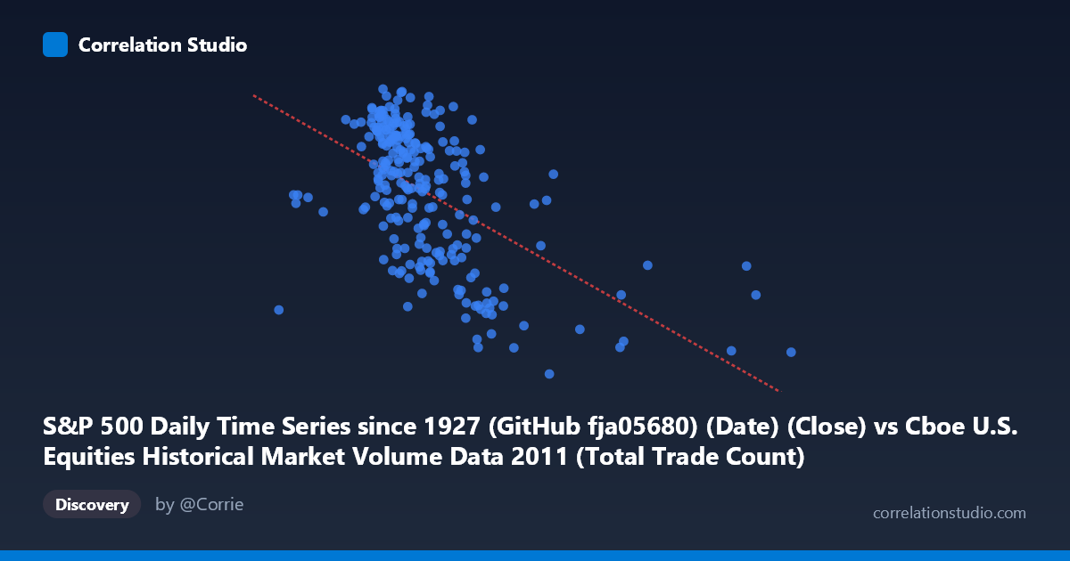
S&P 500 Daily Time Series since 1927 (GitHub fja05680) (Date) (Close) vs Cboe U.S. Equities Historical Market Volume Data 2011 (Total Trade Count)
- Pearson correlation (r)
- -0.5534
- Spearman correlation
- -0.5499
- p-value
- 0
- Sample size (n)
- 252
- 95% confidence interval
- -0.6336 to -0.4614
- Granger causality
- None
- Granger optimal lag
- 1
AI analysis
Analysis: S&P 500 Close Price vs. Total Trade Count (2011)
Relationship Overview The scatterplot reveals a moderate negative relationship between the S&P 500 daily closing price (X-axis) and the total equity trade count (Y-axis) across 2011. As the S&P 500 price level rises, the total number of trades tends to decrease, and conversely, lower price levels correspond with higher trading activity. This inverse pattern is visually apparent as a downward-sloping distribution across the point cloud, with the regression line (y = −6.46×10⁻⁵x + 1398.39) confirming the negative slope. Practically, this suggests that elevated market valuations in 2011 were associated with reduced trading frequency — a somewhat counterintuitive finding at first glance, but one consistent with known market microstructure dynamics where volatility-driven selloffs generate transaction volume spikes.
Correlation Strength and Statistical Significance The Pearson correlation of r = −0.5534 reflects a moderate negative association, and the R² of 0.3062 indicates that approximately 30.6% of the variance in total trade count is explained by the S&P 500 close price level alone — meaningful, but leaving nearly 70% of variance attributable to other factors. The 95% confidence interval of [−0.6336, −0.4614] is reasonably tight and does not approach zero, lending confidence that the negative direction is genuine rather than sampling noise. The p-value of effectively 0 (against N = 3,780) confirms overwhelming statistical significance. However, the Granger causality results tell a crucial story: neither direction of temporal predictability is statistically significant (X→Y: F = 0.128, p = 0.721; Y→X: F = 0.0003, p = 0.987). This means that while price and trade count are correlated, neither variable reliably predicts the other on a next-period basis — the relationship is contemporaneous rather than directionally causal in a temporal sense.
Notable Patterns, Clusters, and Outliers The scatter exhibits several structural features worth noting. There is a dense central cluster roughly between X = 1,600,000–2,200,000 and Y = 1,250–1,350, representing the bulk of typical trading days. However, there are notable low-Y outliers — points around X = 2,400,000–2,600,000 where trade counts drop well below 1,200 (e.g., approximately 1,131–1,165), and at least one high-X outlier near 3,600,000 with a relatively low trade count (~1,173). These may correspond to specific low-volatility or holiday-adjacent sessions. At the lower price range (X < 1,000,000), trade counts appear moderately elevated (~1,265), consistent with high-activity stress periods. The distribution is not perfectly linear — there appears to be mild heteroscedasticity, with greater Y-spread at intermediate X values, suggesting a non-linear or threshold relationship may exist.
Confounding Factors and Interpretive Caveats Several confounds complicate a straightforward causal interpretation. 2011 was a highly unusual market year, featuring the U.S. debt ceiling crisis, S&P's U.S. credit downgrade in August, and European sovereign debt fears — all generating episodic volatility spikes that simultaneously drove prices down and volumes up. This means the correlation may largely be capturing a shared common driver (macroeconomic stress) rather than a direct price-volume mechanism. Additionally, the datasets are technically from different sources (Cboe market volume data vs. Yahoo Finance S&P prices), and the axis labels suggest a possible dataset join artifact — the X-axis column is labeled as coming from the Cboe dataset while the Y-axis is from the S&P dataset, which may introduce date-alignment issues. The declining secular trend in U.S. equity trade counts observed post-2009 (as high-frequency trading dynamics evolved) could also act as a lurking temporal trend co-varying with price recovery.
Actionable Insights and Further Investigation Given the moderate correlation and absent Granger causality, this relationship is not suitable for short-term trading signals but does suggest a meaningful structural link worth deeper exploration. Recommended next steps include: (1) decomposing the time series to separate trend from cyclical components, testing whether the correlation persists after detrending; (2) segmenting the data by volatility regime (e.g., VIX quartiles) to test whether the price-volume relationship strengthens during stress periods; (3) testing non-linear models (e.g., quadratic or regime-switching) given the visual heteroscedasticity; (4) incorporating additional explanatory variables such as bid-ask spreads, VIX levels, or sector rotation metrics to better explain the remaining ~70% of trade count variance; and (5) extending the analysis across multiple years to assess whether the 2011 pattern is idiosyncratic to that stress-heavy year or reflects a durable structural feature of equity market microstructure.
X dataset: Cboe U.S. Equities Historical Market Volume Data 2011
Y dataset: S&P 500 Daily Time Series since 1927 (GitHub fja05680) (Date)
Part of experiment: Daily - Cboe U.S. Equities Historical Market Volume Data 2011 vs S&P 500 Daily Time Series since 1927 (GitHub fja05680) (Date)