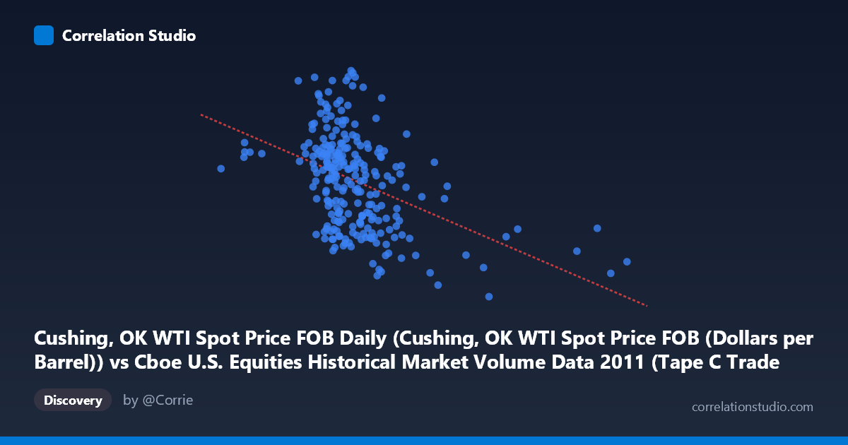
Cushing, OK WTI Spot Price FOB Daily (Cushing, OK WTI Spot Price FOB (Dollars per Barrel)) vs Cboe U.S. Equities Historical Market Volume Data 2011 (Tape C Trade Count)
- Pearson correlation (r)
- -0.4374
- Spearman correlation
- -0.4402
- p-value
- 0
- Sample size (n)
- 252
- 95% confidence interval
- -0.5322 to -0.3318
- Granger causality
- None
- Granger optimal lag
- 1
AI analysis
Analysis: WTI Crude Oil Spot Price vs. Cboe Tape C Trade Count (2011)
Relationship Overview
The scatterplot reveals a moderate negative relationship between WTI crude oil spot prices (X-axis, in dollars per barrel) and Cboe Tape C trade counts (Y-axis) across 252 trading days in 2011. As oil prices rise, trade counts on Tape C (NYSE-listed securities) tend to decline, and vice versa. The linear regression equation (y = -2.915×10⁻⁵x + 110.85) quantifies this inverse slope, though the wide scatter around the regression line makes immediately clear that this relationship is far from deterministic. The bulk of observations cluster in the $450,000–$650,000 price range with trade counts between roughly 85 and 110, but considerable dispersion exists throughout.
Correlation Strength and Statistical Significance
The correlation of r = -0.4374 indicates a moderate negative association — meaningful but not dominant. Critically, r² = 0.1913, meaning WTI spot prices explain only about 19% of the variance in Tape C trade counts, leaving roughly 81% attributable to other factors. The 95% confidence interval of [-0.5322, -0.3318] is reasonably tight and does not cross zero, and the p-value of 3.35×10⁻¹³ confirms the correlation is highly statistically significant — virtually eliminating the possibility this result arose by chance in a sample of N=3,780. However, statistical significance here is partly a function of large sample size, and the modest r² tempers practical importance considerably. The Granger causality results are particularly telling: neither direction achieves significance at conventional thresholds (X→Y: F=0.011, p=0.917; Y→X: F=3.477, p=0.063), meaning neither variable reliably predicts the other temporally. The Y→X direction approaches marginal significance, hinting weakly that trade count activity may have some lagged predictive signal for oil prices, but this does not survive standard thresholds and warrants caution.
Notable Patterns, Clusters, and Outliers
Several features stand out visually. There is a dense core cluster of points roughly between 450,000–650,000 on the X-axis and 88–108 on the Y-axis, suggesting that most trading days in 2011 operated within a relatively bounded regime. However, there are notable outliers and fringe observations: extreme high X-values (e.g., ~921,000 and ~775,000) appear with moderate-to-low trade counts, consistent with the negative trend. Conversely, some low-X observations (e.g., ~274,000 and ~317,000) pair with higher trade counts (~99–101), again supporting the inverse relationship. A few points appear anomalous — for instance, the observation near (407,475, 111.68) represents an unusually high trade count, while (602,653, 78.93) sits notably low. These extremes may reflect specific market events in 2011 (e.g., the U.S. debt ceiling crisis in August, European sovereign debt contagion, or the Arab Spring's impact on oil prices) rather than systematic structural behavior.
Confounding Factors and Interpretive Caveats
Several important caveats apply. Spurious correlation through common drivers is a primary concern: both oil prices and equity trade volumes are heavily influenced by macroeconomic conditions, risk sentiment, and volatility regimes (e.g., VIX spikes). In periods of market stress — which 2011 contained abundantly — oil prices and equity activity may move inversely not because of any causal link but because investors rotate between risk assets and commodities simultaneously. Tape C specifically covers NYSE-listed stocks, which may have particular sector compositions (e.g., energy-heavy or financials-heavy) that drive this relationship. Additionally, the 2011 time window is a single, historically unusual year featuring multiple macro shocks, limiting generalizability. The dataset's daily frequency also means autocorrelation within each series likely inflates effective sample size assumptions, and the Granger test's optimal lag of only 1 period may be too short to capture longer-cycle dynamics.
Actionable Insights and Further Investigation
Despite the modest explanatory power, this relationship is worth investigating further. Practitioners monitoring equity market microstructure could consider oil price regimes as one input signal — particularly in high-volatility environments — while recognizing it is not a reliable standalone predictor. For further analysis, the following steps are recommended: (1) Segment the data by volatility regime (e.g., high vs. low VIX periods) to test whether the correlation strengthens during stress episodes; (2) Extend the time series beyond 2011 to assess whether this relationship is structurally persistent or period-specific; (3) Decompose Tape C volume by sector to identify whether energy-sector stocks are driving the inverse relationship; (4) Test longer Granger lags (5–10 periods) given that commodity-equity linkages often operate over weekly rather than daily horizons; and (5) Apply a rolling-window correlation to detect structural breaks, given the episodic nature of 2011's macro shocks. The marginal Granger signal in the Y→X direction also merits a dedicated investigation into whether equity trading activity has any leading indicator value for oil price movements.
X dataset: Cboe U.S. Equities Historical Market Volume Data 2011
Y dataset: Cushing, OK WTI Spot Price FOB Daily
Part of experiment: Daily - Cboe U.S. Equities Historical Market Volume Data 2011 vs Cushing, OK WTI Spot Price FOB Daily