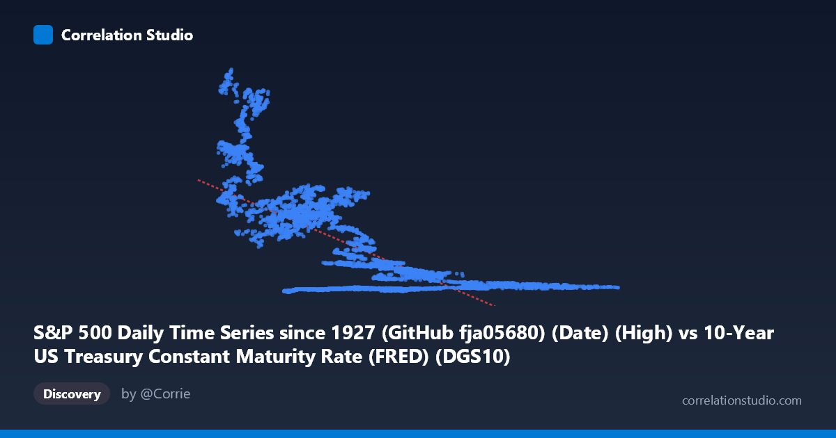
S&P 500 Daily Time Series since 1927 (GitHub fja05680) (Date) (High) vs 10-Year US Treasury Constant Maturity Rate (FRED) (DGS10)
- Pearson correlation (r)
- -0.6596
- Spearman correlation
- -0.537
- p-value
- 0
- Sample size (n)
- 14441
- 95% confidence interval
- -0.6687 to -0.6503
- Granger causality
- None
- Granger optimal lag
- 1
AI analysis
Analysis: S&P 500 High vs. 10-Year US Treasury Yield
Relationship Overview
The scatterplot reveals a negative relationship between the 10-year US Treasury constant maturity rate (X-axis) and the S&P 500 daily high values (Y-axis), consistent with the well-established inverse dynamic between interest rates and equity valuations. The linear regression equation (y = -170.69x + 1775.95) suggests that for every 1 percentage point increase in the 10-year yield, the S&P 500 daily high decreases by approximately 171 points on average. However, the data cloud shows considerable scatter and non-linear clustering, indicating that a simple linear model captures only part of a more complex story. Notably, the sample points reveal two visually distinct behavioral zones: a cluster of high-Y, low-X values (e.g., yields near 2–4% paired with S&P readings above 1,000–2,600) and a dense cluster of low-Y, mid-to-high-X values (e.g., yields of 6–11% paired with S&P readings below 500), strongly reflecting the temporal separation between the high-rate 1970s–1990s era and the post-2008 low-rate, high-equity environment.
Correlation Strength and Statistical Significance
The Pearson correlation of r = -0.66 indicates a moderate-to-strong negative linear association, and with r² = 0.4351, approximately 43.5% of the variance in S&P 500 highs is statistically explained by the 10-year yield. This is a meaningful but incomplete explanatory relationship — more than half the variance remains unexplained by yield alone. The 95% confidence interval of [-0.6687, -0.6503] is extremely narrow given the large sample (N = 16,799, n = 14,441), and the p-value of effectively zero confirms the correlation is highly statistically significant, virtually eliminating the possibility this result arose by chance. That said, statistical significance at this scale is almost guaranteed even for trivially small effects; the practical significance is better judged by the r² magnitude, which is substantial but not dominant. Critically, the Granger causality tests return no significant directional predictive relationship in either direction (X→Y: F = 0.185, p = 0.667; Y→X: F = 0.143, p = 0.705), meaning that despite the strong contemporaneous correlation, neither variable reliably predicts the other at a one-period lag. This is an important caveat: correlation here likely reflects shared macroeconomic drivers rather than a direct causal channel between yields and equity prices.
Notable Patterns, Clusters, and Non-Linearity
The sample points make several structural features visible. There is a pronounced non-linear, hyperbolic-like dispersion: at low yields (1.5–4%), Y values span an enormous range from roughly 57 to over 2,600, while at higher yields (8–11%), Y values compress tightly near 80–400. This heteroscedasticity suggests that low interest rate environments are far more variable in their equity outcomes — low rates are a necessary but not sufficient condition for high equity valuations. Several extreme outliers appear at low X values: points like (2.33, 2634), (2.75, 1827), and (1.59, 1400) represent the post-2008/post-2020 era where quantitative easing suppressed yields while equities soared to historic highs. Conversely, the tight cluster of low S&P values at high yields reflects the 1970s–1980s stagflation period when equities were range-bound despite (or because of) elevated rates. A linear model is likely a poor fit for this data structure; a log-transformation of Y or a piecewise regression would better capture the regime-dependent nature of the relationship.
Confounding Factors and Interpretive Caveats
The most significant confounding factor is time itself. Both variables have trended dramatically over the 1962–2019 period: Treasury yields peaked around 1981 and fell for nearly four decades (the "great bond bull market"), while the S&P 500 experienced secular long-run growth punctuated by cyclical downturns. The observed negative correlation may largely reflect two non-stationary time series moving in opposite long-run directions — a classic spurious or trend-driven correlation. The axes have effectively been swapped from the typical presentation (yield on Y, equities on X), which is worth noting for interpretive clarity. Additional confounders include corporate earnings growth, inflation expectations, Federal Reserve policy regimes, demographic shifts in investment flows, and global capital allocation. The fact that the dataset spans different monetary policy eras (Bretton Woods, Volcker shock, Greenspan put, zero lower bound, QE) means the structural relationship between these variables likely shifted multiple times across the sample period, making a single correlation coefficient potentially misleading as a summary statistic.
Actionable Insights and Further Investigation
Several analytical extensions would substantially improve understanding here. First, detrending or first-differencing both series before computing correlations would help isolate the genuine short-run relationship from the shared secular trends. Second, a regime-switching or rolling-window correlation analysis (e.g., 3–5 year windows) would reveal whether the yield-equity relationship strengthened or reversed across different monetary policy eras — there is strong theoretical reason to expect this. Third, given the non-linearity observed, a log transformation of S&P values or a quantile regression approach would better model the heteroscedastic structure. Fourth, incorporating earnings yield (the inverse of P/E ratio) alongside Treasury yields — effectively the "Fed Model" framework — would provide a more theoretically grounded basis for the relationship. Finally, the absence of Granger causality at a 1-period lag warrants testing at longer lags (weekly, monthly), as market participants typically respond to rate changes over weeks to months rather than single trading days. Practitioners should be cautious about using this correlation for tactical allocation decisions without these refinements.
X dataset: 10-Year US Treasury Constant Maturity Rate (FRED)
Y dataset: S&P 500 Daily Time Series since 1927 (GitHub fja05680) (Date)
Part of experiment: Daily - 10-Year US Treasury Constant Maturity Rate (FRED) vs S&P 500 Daily Time Series since 1927 (GitHub fja05680) (Date)