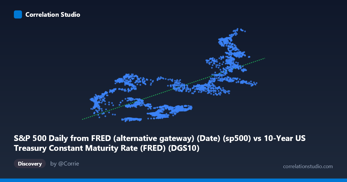
S&P 500 Daily from FRED (alternative gateway) (Date) (sp500) vs 10-Year US Treasury Constant Maturity Rate (FRED) (DGS10)
- Pearson correlation (r)
- 0.6468
- Spearman correlation
- 0.576
- p-value
- 0
- Sample size (n)
- 2497
- 95% confidence interval
- 0.6234 to 0.6691
- Granger causality
- None
- Granger optimal lag
- 10
AI analysis
Analysis: S&P 500 Levels vs. 10-Year Treasury Yield (2016–2026)
1. Overall Relationship Revealed
The scatterplot reveals a positive, moderately strong relationship between the 10-year US Treasury constant maturity yield (X-axis) and the S&P 500 index level (Y-axis) over the period 2016–2026. As Treasury yields rise, S&P 500 values tend to be higher, with the linear regression equation y = 743.82x + 1888.58 suggesting roughly 744 additional index points per percentage point increase in yield. However, the scatter is substantial — the cloud of points is wide, particularly in the mid-range of X values (roughly 1.5–3.5%), where Y values span nearly the full range of the dataset. This immediately signals that while a trend exists, the relationship is far from deterministic and is likely shaped heavily by the shared temporal structure of both series across a decade of distinct macroeconomic regimes.
2. Correlation Strength, Explained Variance, and Causality
The Pearson correlation of r = 0.647 is statistically significant (p ≈ 0, n = 2,497), and the tight 95% confidence interval of [0.623, 0.669] confirms this is a stable, well-estimated association rather than a sampling artifact. That said, R² = 0.418 means only ~42% of the variance in S&P 500 levels is explained by the 10-year yield — a meaningful but decidedly incomplete picture, leaving 58% of variance attributable to other forces. Practically, this correlation is likely spurious in a causal sense, driven by the fact that both variables trended upward together during 2016–2021 and then moved again in tandem during the 2022 rate-hiking cycle. The Granger causality results confirm this suspicion: neither X→Y (F = 1.12, p = 0.34) nor Y→X (F = 0.61, p = 0.81) shows significant temporal predictive power at the optimal 10-period lag. This is a critical finding — the correlation does not reflect any directional, leading-indicator relationship between these variables; neither series systematically predicts the other's future movement.
3. Notable Patterns, Clusters, and Non-Linearity
Several distinct clusters are visible in the sample points, consistent with discrete macroeconomic eras: - A low-yield cluster (X ≈ 0.5–1.8%) with Y values spanning roughly 2,100–4,700, corresponding to the ultra-low-rate environment of 2020–2021 - A mid-yield cluster (X ≈ 2.5–3.5%) with Y values compressed around 2,700–4,200, reflecting 2018–2019 and the 2022 correction period - A high-yield, high-equity cluster (X ≈ 4.0–5.0%, Y ≈ 5,400–7,500), corresponding to 2023–2025 when the Fed held rates high while equities recovered and surged
This multi-cluster structure is a hallmark of regime-dependent data rather than a smooth continuous relationship. Notable outliers include points like (4.41, 7,337) and (4.16, 6,638), which sit well above the regression line, suggesting periods where equities dramatically outperformed what yield levels alone would predict. The apparent linearity may be masking an underlying non-linear or piecewise relationship.
4. Confounding Factors and Caveats
The most significant caveat is shared time-trend confounding: both series are non-stationary time series with strong secular trends, meaning the positive correlation may largely reflect that they both increased over the same decade rather than any true structural link. Conventionally, finance theory predicts a negative relationship between rising rates and equity valuations (higher discount rates reduce present value of future earnings), yet the data show a positive correlation — almost certainly because both variables are being driven by underlying economic growth, inflation cycles, and Federal Reserve policy shifts that are not captured here. Additional confounders include quantitative easing/tightening cycles, corporate earnings growth, fiscal stimulus (2020–2021), and global capital flows. Running this analysis on first-differenced or detrended data would be a far more rigorous test of the actual relationship between yield changes and equity price changes.
5. Actionable Insights and Further Investigation
| Recommendation | Rationale | |---|---| | Detrend both series before correlating | Remove shared time-trend to test genuine co-movement | | Analyze by regime (pre/post-COVID, hiking cycles) | The cluster structure suggests the relationship changes sign across periods | | Use first differences (daily yield change vs. daily return) | This is the standard finance approach and avoids spurious correlation | | Test non-linear models (piecewise, quadratic) | The cluster pattern suggests a simple linear fit is inadequate | | Add macro controls (inflation, GDP growth, VIX) | Partial out confounders to isolate the yield-equity channel |
The core takeaway is that while the correlation is real and statistically robust, its practical and causal interpretation is weak — it reflects shared macro history more than a reliable predictive or structural relationship. Analysts should be cautious about using yield levels alone to forecast equity performance.
X dataset: 10-Year US Treasury Constant Maturity Rate (FRED)
Y dataset: S&P 500 Daily from FRED (alternative gateway) (Date)
Part of experiment: Daily - 10-Year US Treasury Constant Maturity Rate (FRED) vs S&P 500 Daily from FRED (alternative gateway) (Date)