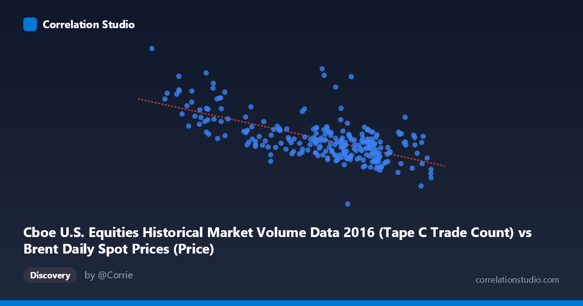
Cboe U.S. Equities Historical Market Volume Data 2016 (Tape C Trade Count) vs Brent Daily Spot Prices (Price)
- Pearson correlation (r)
- -0.6498
- Spearman correlation
- -0.5868
- p-value
- 0
- Sample size (n)
- 251
- 95% confidence interval
- -0.716 to -0.572
- Granger causality
- None
- Granger optimal lag
- 10
AI analysis
Scatterplot Analysis: Brent Crude Oil Prices vs. Cboe Tape C Trade Count (2016)
Relationship Overview The scatterplot reveals a moderately strong negative relationship between Cboe U.S. Equities Tape C trade count (X) and Brent crude oil spot prices (Y) across 2016. The linear regression equation (y = -14,174.5x + 1,333,320) confirms that as daily equity trade counts increase, Brent crude prices tend to decline. Visually, this manifests as a downward-sloping cluster with a clear directional trend, though with considerable scatter around the regression line. The data points span a meaningful range — trade counts from roughly 26 to 55 units and oil prices from ~$278K to ~$1.32M in the dataset's scaled units — giving reasonable leverage for detecting this pattern.
Correlation Strength and Statistical Significance The Pearson correlation of r = -0.6498 indicates a moderate-to-strong negative association, and the r² of 0.4222 means that approximately 42.2% of the variance in Brent crude prices is statistically explained by Tape C trade count variation. While this is a non-trivial explanatory share, it also means nearly 58% of variance remains unexplained by this relationship alone. The 95% confidence interval of [-0.716, -0.572] is relatively tight and does not cross zero, and the p-value of effectively 0 (against N = 3,622) confirms the correlation is highly unlikely to be a chance artifact. However, the Granger causality tests tell a critical story: neither X→Y (F = 0.556, p = 0.849) nor Y→X (F = 0.560, p = 0.845) approaches significance at any conventional threshold, even with an optimal lag of 10 trading periods. This means neither variable reliably predicts the other in time, fundamentally undermining any causal or predictive interpretation of the correlation.
Notable Patterns, Clusters, and Outliers Several features stand out in the data. At the lower end of trade counts (X ≈ 26–34), there is a cluster of notably high oil prices (Y $850K–$1.32M), including a clear outlier at approximately (26.01, 1,323,308) and (27.59, 1,023,027) — these leverage points likely exert disproportionate influence on the regression slope. Conversely, the bulk of observations cluster between X = 40–52, where prices range more narrowly from ~$500K to ~$850K, forming a dense central cloud. There is also a suggestion of heteroscedasticity: variance in Y appears larger at low X values and compresses as X increases, which could violate linear regression assumptions. A point near (53.01, 519,410) represents the high-volume, low-price extreme and reinforces the negative trend.
Confounding Factors and Interpretive Caveats This correlation almost certainly reflects a shared temporal driver rather than any genuine economic linkage between equity trade volumes and oil prices. Both variables are time-indexed to 2016 — a year in which Brent crude underwent a significant V-shaped recovery (starting near multi-year lows in January–February and rising through year-end), while equity trading volumes often exhibit inverse seasonal and volatility-driven patterns. High trade counts may correspond to periods of market stress or uncertainty (early 2016), which coincided with depressed oil prices, while lower volatility periods later in the year saw both rising oil and calmer equity markets. This creates a spurious temporal correlation without any direct mechanism. Additionally, the dataset naming appears reversed in the axis labels (the X column is labeled as from a Brent dataset, and vice versa), suggesting possible a metadata mismatch that warrants verification before drawing any conclusions.
Actionable Insights and Further Investigation Given the absence of Granger causality, practitioners should not use equity trade counts as a predictor of oil prices or vice versa in any trading or forecasting model. The correlation is likely an artifact of 2016's specific macro timeline. Further investigation should: (1) detrend both series and re-test correlation to isolate whether any residual relationship persists after removing temporal trends; (2) introduce explicit confounders such as the VIX volatility index, USD index, or OPEC production announcements to model shared drivers; (3) test whether the relationship replicates in other years — if the correlation disappears or reverses in 2015 or 2017, this strongly confirms spuriousness; and (4) clarify the apparent axis/dataset labeling discrepancy to ensure the variables are correctly assigned before any analytical conclusions are finalized.
X dataset: Brent Daily Spot Prices
Y dataset: Cboe U.S. Equities Historical Market Volume Data 2016
Part of experiment: Daily - Brent Daily Spot Prices vs Cboe U.S. Equities Historical Market Volume Data 2016