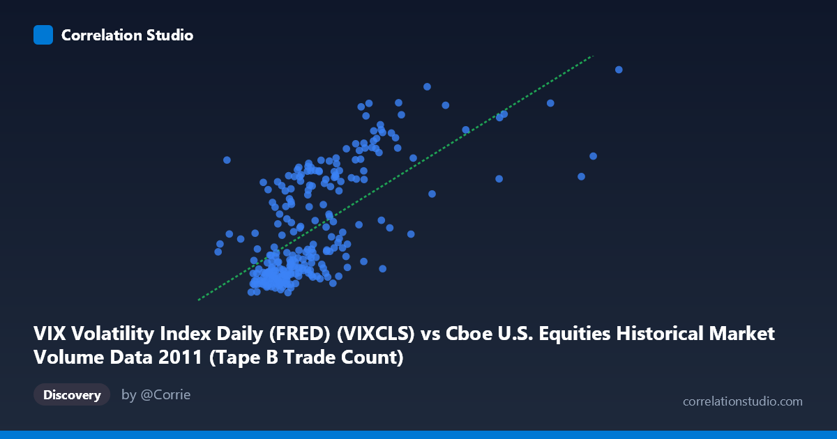
VIX Volatility Index Daily (FRED) (VIXCLS) vs Cboe U.S. Equities Historical Market Volume Data 2011 (Tape B Trade Count)
- Pearson correlation (r)
- 0.6623
- Spearman correlation
- 0.6684
- p-value
- 0
- Sample size (n)
- 252
- 95% confidence interval
- 0.5868 to 0.7265
- Granger causality
- None
- Granger optimal lag
- 1
AI analysis
Analysis: VIX Volatility Index vs. Cboe Tape B Trade Count (2011)
Relationship Overview The scatterplot reveals a moderately strong positive relationship between the VIX Volatility Index and Cboe Tape B trade counts during 2011. As VIX values rise — indicating heightened market fear and implied volatility — the number of Tape B trades increases correspondingly. This makes intuitive sense: periods of market stress and uncertainty typically trigger elevated trading activity as investors reposition, hedge, or liquidate holdings. The linear regression equation (y = 5.15×10⁻⁵x + 9.72) suggests that for every 10,000-unit increase in daily market volume (X), the VIX rises by approximately 0.51 points, though the directionality of this interpretation warrants caution.
Correlation Strength and Statistical Significance The correlation of r = 0.6623 indicates a moderate-to-strong positive association, but the r² of 0.4387 is the more sobering figure — only 43.9% of the variance in VIX is explained by Tape B trade counts, meaning the majority of VIX fluctuation stems from other factors entirely. The 95% confidence interval [0.5868, 0.7265] is reassuringly tight, and the p-value of effectively zero across a sample of 252 paired observations (from a population of 3,780) confirms this relationship is highly unlikely to be a statistical artifact. However, the Granger causality results are notably null: neither X→Y (F=0.058, p=0.810) nor Y→X (F=0.162, p=0.688) shows significant predictive directionality at a one-period lag. This is a critical finding — despite the meaningful contemporaneous correlation, neither variable reliably predicts the other the following day, suggesting the relationship is largely coincident rather than causal.
Notable Patterns, Clusters, and Outliers The data exhibit several structurally distinct clusters worth noting. A dense concentration of points sits in the lower-left region (X: ~150,000–300,000; Y: ~14–22), representing calm, low-volatility trading days that dominated much of 2011. A second, more dispersed cluster occupies the upper-right quadrant (X: ~350,000–560,000; Y: ~30–48), corresponding to the pronounced market stress periods of 2011 — most likely the summer debt-ceiling crisis and August market sell-off, as well as European sovereign debt contagion episodes. Several apparent outliers are visible at extreme VIX values (~42–48) paired with very high trade counts, which likely represent peak crisis days. Notably, the relationship appears somewhat non-linear: variance in Y increases substantially at higher X values (heteroscedasticity), suggesting a linear model may underfit the stress-regime behavior.
Confounding Factors and Caveats Several important caveats apply. First, 2011 was an abnormal year featuring extreme macroeconomic events (U.S. credit downgrade, Eurozone crisis), which may have structurally inflated both VIX and trade volumes simultaneously — meaning the correlation could reflect shared exposure to a common shock rather than a stable underlying relationship. Second, Tape B specifically covers NYSE American and regional exchange equities, which may not be representative of broader market volume dynamics. Third, the apparent heteroscedasticity suggests that a log-linear or regime-switching model might better capture the relationship than a simple OLS regression. Finally, the absence of Granger causality at a one-period lag doesn't preclude causality at longer lags, and intraday dynamics — not captured in daily data — may be where the real predictive relationship lives.
Actionable Insights and Further Investigation Practitioners should avoid using daily Tape B trade counts as a standalone VIX predictor given the failed Granger tests, despite the attractive r value. Instead, this relationship is better framed as a concurrent stress indicator: spikes in Tape B volume alongside rising VIX may serve as a confirmation signal for risk-off regimes rather than a leading one. Recommended next steps include: (1) testing Granger causality at lags of 2–5 periods to explore slower-moving predictive dynamics; (2) fitting a regime-switching or piecewise regression to separately model calm vs. stress market states; (3) expanding the dataset beyond 2011 to test whether this correlation holds across structurally different volatility environments such as 2017 (historically low VIX) or 2020 (COVID spike); and (4) decomposing Tape B trade counts by trade size to determine whether retail or institutional activity is the primary driver of the high-VIX, high-volume observations.
X dataset: Cboe U.S. Equities Historical Market Volume Data 2011
Y dataset: VIX Volatility Index Daily (FRED)
Part of experiment: Daily - Cboe U.S. Equities Historical Market Volume Data 2011 vs VIX Volatility Index Daily (FRED)