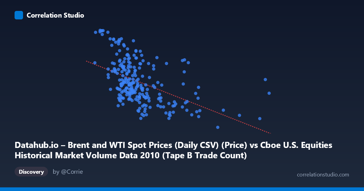
Datahub.io – Brent and WTI Spot Prices (Daily CSV) (Price) vs Cboe U.S. Equities Historical Market Volume Data 2010 (Tape B Trade Count)
- Pearson correlation (r)
- -0.4964
- Spearman correlation
- -0.5404
- p-value
- 0
- Sample size (n)
- 252
- 95% confidence interval
- -0.5842 to -0.3972
- Granger causality
- None
- Granger optimal lag
- 1
AI analysis
Analysis: Brent/WTI Oil Prices vs. Cboe Tape B Trade Count (2010)
Relationship Overview The scatterplot reveals a moderate negative relationship between daily U.S. equity market volume (specifically Cboe Tape B trade counts, plotted on the X-axis per the data labels) and Brent/WTI spot oil prices (Y-axis) across 252 trading days in 2010. The linear regression equation (y = -2.27×10⁻⁵x + 86.50) indicates that as equity market trade counts increase, oil prices tend to decline — or conversely, higher oil prices coincide with periods of lower market trading activity. The data spans a meaningful range, with trade counts from roughly 96K to 919K and oil prices from $67 to nearly $94 per barrel, providing reasonable coverage to assess the relationship.
Correlation Strength and Statistical Framing The Pearson correlation of r = -0.496 indicates a moderate negative association. However, r² = 0.2464 is the more practically important figure: only 24.6% of the variance in oil prices is explained by trade count volume, meaning roughly three-quarters of oil price variation is driven by factors entirely outside this relationship. The 95% confidence interval of [-0.584, -0.397] is meaningfully bounded away from zero and does not cross zero, confirming the correlation is reliably negative. The p-value of effectively 0 (given N = 3,302 population context) confirms statistical significance. Critically, however, Granger causality tests reveal no significant predictive directionality in either direction — neither X→Y (F = 0.28, p = 0.59) nor Y→X (F = 2.58, p = 0.11) is significant at conventional thresholds. This means that while a contemporaneous correlation exists, neither variable meaningfully predicts the other's future values at a 1-period lag, substantially limiting any causal interpretation.
Notable Patterns, Clusters, and Outliers Several features stand out in the sampled data. There is a visible cluster of observations at lower trade counts (roughly 150K–350K) with widely dispersed oil prices (ranging from ~74 to ~93), suggesting high variability in oil prices even when market activity is moderate. At higher trade counts (above 450K), oil prices compress notably toward the lower end of the range (roughly $67–$77), which drives much of the negative correlation. A handful of notable outliers are apparent: the point at approximately (918,659; $76.48) represents an extreme high-volume day with a mid-range oil price, and the cluster near (120,757; $93.63) and (134,700; $93.55) shows very low trade volume coinciding with peak oil prices — these high-leverage points likely exert disproportionate influence on the regression slope. The relationship also appears somewhat non-linear, with greater price dispersion at low volumes than at high volumes, suggesting a potential heteroscedastic or fan-shaped pattern rather than a clean linear trend.
Confounding Factors and Caveats Several important caveats apply. First, the dataset label pairing appears counterintuitive — the X-axis is described as oil price data while the Y-axis is described as trade count, yet the column names suggest they may be swapped in practice, warranting careful verification before drawing conclusions. Second, 2010 was a distinctive macroeconomic period — recovering from the 2008–09 financial crisis — during which both oil prices and market volumes were simultaneously influenced by macro sentiment, risk appetite, and Federal Reserve policy, all classic confounders. Third, seasonality could play a role: oil demand fluctuates with seasons, and equity volume has known cyclical patterns (e.g., summer slowdowns). Fourth, the Granger test uses only a 1-period lag, and longer lags might reveal delayed relationships not captured here.
Actionable Insights and Further Investigation Given that the correlation is statistically robust but explains less than a quarter of variance and lacks Granger-causal support, practitioners should not use this relationship as a predictive trading signal without further validation. Recommended next steps include: (1) controlling for macroeconomic confounders such as VIX (volatility index), S&P 500 returns, and USD index to test whether the correlation is spurious; (2) testing longer Granger lags (e.g., 5–10 periods) to check for delayed predictive relationships; (3) segmenting the data by market regime or season to test whether the negative relationship is consistent or driven by specific sub-periods; and (4) exploring non-linear models (e.g., spline or quantile regression) given the apparent heteroscedasticity. The outliers at extreme trade volumes should also be examined individually to determine whether they represent data anomalies or genuinely informative market events.
X dataset: Cboe U.S. Equities Historical Market Volume Data 2010
Y dataset: Datahub.io – Brent and WTI Spot Prices (Daily CSV)
Part of experiment: Daily - Cboe U.S. Equities Historical Market Volume Data 2010 vs Datahub.io – Brent and WTI Spot Prices (Daily CSV)