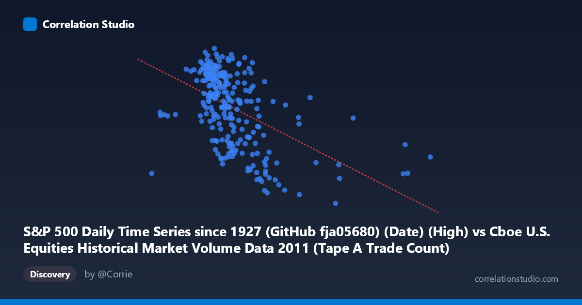
S&P 500 Daily Time Series since 1927 (GitHub fja05680) (Date) (High) vs Cboe U.S. Equities Historical Market Volume Data 2011 (Tape A Trade Count)
- Pearson correlation (r)
- -0.5033
- Spearman correlation
- -0.5377
- p-value
- 0
- Sample size (n)
- 252
- 95% confidence interval
- -0.5901 to -0.4049
- Granger causality
- None
- Granger optimal lag
- 1
AI analysis
Analysis: S&P 500 Daily High vs. Cboe Tape A Trade Count (2011)
Relationship Overview The scatterplot reveals a moderate negative relationship between the S&P 500 daily high price (X-axis) and the Cboe Tape A trade count (Y-axis) across 252 trading days in 2011. As the S&P 500 reached higher price levels, the number of individual trades on Tape A (NYSE-listed securities) tended to decrease. This inverse pattern is visually apparent in the downward-sloping regression line (y = −0.0000927x + 1388.06), with the cloud of points showing a discernible but noisy declining trend from left to right. The relationship is intuitive in a broad sense: periods of market stress or lower index levels in 2011 (driven heavily by the European sovereign debt crisis and the August U.S. credit downgrade) coincided with elevated trading activity and fragmentation.
Correlation Strength and Statistical Significance The Pearson correlation of r = −0.503 indicates a moderate negative association, with R² = 0.253, meaning approximately 25.3% of the variance in Tape A trade counts is explained by the S&P 500 daily high. While statistically meaningful, this leaves roughly three-quarters of the variance unexplained by this linear relationship alone. The 95% confidence interval of [−0.590, −0.405] is reasonably tight and lies entirely in negative territory, providing strong confidence in the direction of the effect. The p-value of effectively zero (given N = 3,780 in the population context) confirms this is not a chance finding. However, the Granger causality results are telling: neither direction (X→Y: F = 0.083, p = 0.773; Y→X: F = 0.013, p = 0.909) approaches significance, meaning that neither variable temporally predicts the other at a 1-period lag. This dissociates statistical correlation from any predictive or causal temporal mechanism — the two variables move together contemporaneously, but knowing yesterday's value of one does not help forecast today's value of the other.
Notable Patterns, Clusters, and Outliers The data points form a somewhat elongated, dispersed cloud with several visible features. There is a dense core cluster centered roughly between X = 950,000–1,350,000 and Y = 1,250–1,355, representing the bulk of "normal" 2011 trading days. A secondary cluster of lower trade counts (Y ≈ 1,125–1,215) appears at higher S&P 500 highs (X 1,450,000), consistent with the calmer, lower-volatility market conditions of early 2011 before the summer turmoil. Several potential outliers are visible at extreme X values — notably a point near X = 2,126,542 with a relatively low Y (~1,186), and another near X = 493,368 (the dataset minimum) — which may represent data anomalies, index reconstitution effects, or reporting irregularities. The spread of Y values widens at intermediate X values, suggesting heteroscedasticity, where variance in trade counts is higher during mid-range index levels.
Confounding Factors and Caveats Several important caveats apply. First, 2011 was an exceptionally volatile year — the August flash crash fears, debt ceiling debate, and European crisis created structural breaks in both price and volume behavior, meaning this single-year sample may not generalize. Second, the S&P 500 "High" as an X variable captures intraday extremes rather than closing or average levels, which may amplify noise. Third, trade count on Tape A reflects only NYSE-listed securities and is sensitive to market microstructure changes such as exchange routing incentives, HFT participation, and fragmentation — factors entirely independent of index price levels. Fourth, the relationship likely reflects a common driver (realized or implied volatility, specifically the VIX, which spiked dramatically in August 2011) rather than a direct price-volume mechanism, making this a classic case where a latent third variable explains the observed correlation.
Actionable Insights and Further Investigation Given the moderate but incomplete explanatory power and the absence of Granger causality, practitioners should resist using S&P 500 price levels as a standalone predictor of trade counts. A more productive path would involve incorporating the VIX or realized volatility as an explicit variable, which likely mediates much of this relationship. It would also be valuable to extend the analysis across multiple years to test whether the negative correlation is a stable structural feature or an artifact of 2011's unique macro environment. A non-linear or regime-switching model may better capture the behavior, particularly separating low-volatility (r possibly near zero) from high-volatility regimes (r strongly negative). Finally, examining Tape B and Tape C trade counts alongside Tape A would help determine whether the pattern reflects broad market behavior or is specific to NYSE-listed securities.
X dataset: Cboe U.S. Equities Historical Market Volume Data 2011
Y dataset: S&P 500 Daily Time Series since 1927 (GitHub fja05680) (Date)
Part of experiment: Daily - Cboe U.S. Equities Historical Market Volume Data 2011 vs S&P 500 Daily Time Series since 1927 (GitHub fja05680) (Date)