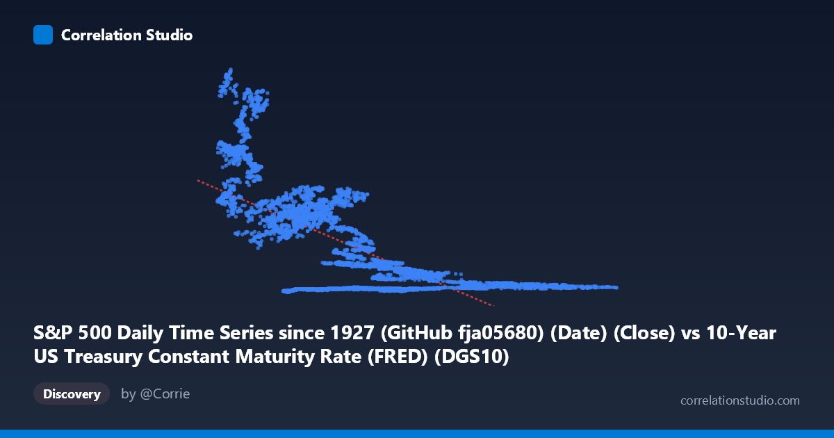
S&P 500 Daily Time Series since 1927 (GitHub fja05680) (Date) (Close) vs 10-Year US Treasury Constant Maturity Rate (FRED) (DGS10)
- Pearson correlation (r)
- -0.6593
- Spearman correlation
- -0.5374
- p-value
- 0
- Sample size (n)
- 14441
- 95% confidence interval
- -0.6685 to -0.65
- Granger causality
- None
- Granger optimal lag
- 1
AI analysis
S&P 500 Price vs. 10-Year Treasury Yield: Correlation Analysis
Overview of the Relationship
The scatterplot reveals a broadly negative relationship between the 10-year US Treasury constant maturity yield (X-axis) and the S&P 500 closing price (Y-axis), meaning that higher interest rates tend to coincide with lower equity valuations, and vice versa. The linear regression equation (y = −169.87x + 1766.79) suggests that for each 1-percentage-point increase in the 10-year yield, the S&P 500 is associated with roughly a 170-point decline. However, the data cloud is wide and heterogeneous — the relationship is far from deterministic, and there are clearly multiple regimes and clusters embedded within the 57-year span (1962–2019) covered by this dataset.
Correlation Strength, Direction, and Statistical Framing
The Pearson correlation of r = −0.6593 confirms a moderate-to-strong negative association, but the r² of 0.4347 is the more honest metric: only 43.5% of the variance in S&P 500 prices is explained by Treasury yields, leaving over 56% attributable to other factors entirely. The 95% confidence interval of [−0.6685, −0.6500] is extremely narrow given the large paired sample (n = 14,441), and the p-value of effectively zero confirms this is not a statistical artifact — the negative relationship is real and highly reliable at the population level. However, Granger causality tests tell a critically different story: neither direction (X→Y nor Y→X) achieves significance (F = 0.20, p = 0.66 and F = 0.15, p = 0.70 respectively), meaning that at a one-period lag, neither variable reliably predicts the other's next-day movement. The correlation reflects a long-run structural co-movement across decades, not a short-term predictive signal suitable for trading or forecasting.
Notable Patterns, Clusters, and Non-Linearity
The sample points expose considerable heterogeneity that a single linear fit masks poorly. There appear to be at least two distinct behavioral clusters: one where low yields (X ≈ 1.5–4.5%) coincide with a wide range of S&P 500 prices from under 100 to over 2,600 — suggesting this zone captures the post-2008 low-rate era when the S&P was simultaneously recovering and then surging — and another where moderate-to-high yields (X ≈ 6–12%) cluster at relatively low S&P prices, consistent with the 1970s–1990s period. The extreme outliers at low X values (e.g., X ≈ 2.33, Y ≈ 2,629; X ≈ 2.09, Y ≈ 1,261) are almost certainly post-2008 or post-2015 observations where historically low yields coexisted with high equity prices — actually inverting the expected linear relationship locally. This suggests the true functional form may be non-linear or regime-dependent, and a single linear regression is likely a significant oversimplification.
Confounding Factors and Interpretation Caveats
Several major confounds challenge a causal interpretation. First, both variables are strongly trended over time — the S&P 500 has an upward secular trend while 10-year yields rose through the 1970s–early 1980s and fell thereafter — meaning much of the observed correlation may be spurious co-trending rather than a structural economic relationship. Second, the era effect is profound: the post-2008 quantitative easing environment created a historically anomalous combination of near-zero yields and rising equity prices that directly contradicts the dominant pattern from earlier decades. Third, earnings growth, inflation regimes, risk appetite, Federal Reserve policy cycles, and global capital flows all independently drive both variables, acting as powerful unmeasured confounders. The wide Y-range (52 to 3,221) relative to the narrow X-range (1.44 to 15.68) further suggests that equity prices are far more volatile and multi-determined than yield levels alone can explain.
Actionable Insights and Further Investigation
Given the regime-dependent nature of this relationship, the most productive next steps would include: (1) segmenting the analysis by macroeconomic era (pre-1980 rising rate environment, 1980–2008 falling rate environment, post-2008 ZIRP era) to test whether the correlation holds, reverses, or disappears within regimes; (2) applying non-linear models (spline regression, regime-switching models, or LOESS smoothing) to better capture the curvature visible in the data cloud; (3) using real (inflation-adjusted) yields and real S&P prices (e.g., Shiller CAPE) to remove the trend confound; and (4) extending Granger causality tests to longer lags (e.g., weekly or monthly) where the macro transmission mechanism may operate more meaningfully. The absence of short-term Granger causality is itself an important finding — it cautions against using yield changes as a tactical market-timing signal, even though the long-run structural relationship is statistically robust.
X dataset: 10-Year US Treasury Constant Maturity Rate (FRED)
Y dataset: S&P 500 Daily Time Series since 1927 (GitHub fja05680) (Date)
Part of experiment: Daily - 10-Year US Treasury Constant Maturity Rate (FRED) vs S&P 500 Daily Time Series since 1927 (GitHub fja05680) (Date)