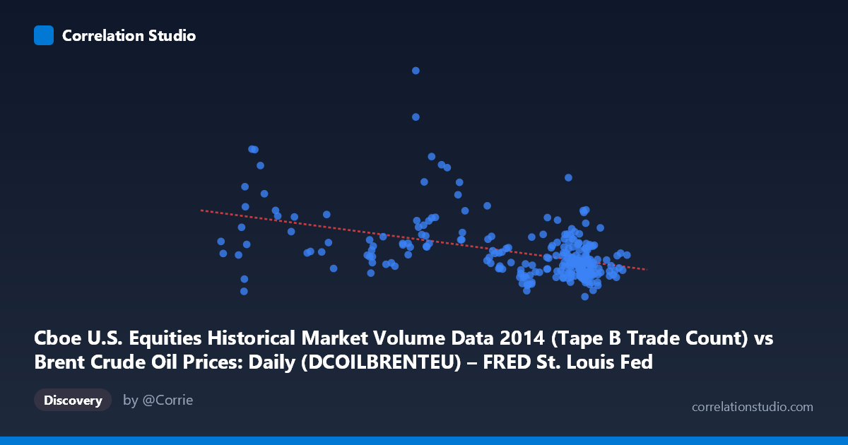
Cboe U.S. Equities Historical Market Volume Data 2014 (Tape B Trade Count) vs Brent Crude Oil Prices: Daily (DCOILBRENTEU) – FRED St. Louis Fed (DCOILBRENTEU)
- Pearson correlation (r)
- -0.4503
- Spearman correlation
- -0.4185
- p-value
- 0
- Sample size (n)
- 252
- 95% confidence interval
- -0.5436 to -0.3459
- Granger causality
- None
- Granger optimal lag
- 10
AI analysis
Analysis: Brent Crude Oil Prices vs. Cboe Tape B Trade Count (2014)
Relationship Overview The scatterplot reveals a moderate negative relationship between Cboe U.S. Equities Tape B trade counts (X) and Brent Crude Oil prices (Y) across 252 trading days in 2014. As equity trade volume increases, crude oil prices tend to decline — a pattern that, while statistically clear, carries substantial scatter across the full range of observations. The linear regression equation (y = -2251.82x + 444,121) suggests that each unit increase in trade count is associated with roughly a $2,252 decrease in the oil price metric, though the wide dispersion around this line immediately signals that the relationship is far from deterministic.
Correlation Strength and Statistical Significance The correlation of r = -0.4503 reflects a moderate inverse association, but the coefficient of determination (R² = 0.2027) is the more sobering figure: only ~20.3% of the variance in Brent Crude prices is explained by Tape B trade count, leaving nearly 80% attributable to other factors. The relationship is nonetheless highly statistically significant (p = 5.55 × 10⁻¹⁴), and the 95% confidence interval [−0.544, −0.346] is entirely negative, confirming the inverse direction is not a sampling artifact given n = 252. However, statistical significance here is partly a function of the large underlying population (N = 3,686); the effect size itself is modest and should not be overstated. Critically, Granger causality tests find no significant temporal predictive direction in either direction (X→Y: F = 1.02, p = 0.43; Y→X: F = 1.39, p = 0.19), meaning that past values of trade count do not meaningfully predict future oil prices, and vice versa. This effectively rules out a simple lead-lag causal mechanism between the two series.
Notable Patterns, Clusters, and Outliers Several structural features stand out in the data. There is a visible cluster of high-volume trading days (X ≈ 105–115) concentrated at relatively lower oil price levels (Y ≈ 140,000–230,000), consistent with the negative slope. Conversely, a distinct low-volume cluster (X ≈ 55–70) shows considerably more vertical spread, with Y values ranging from roughly 120,000 to nearly 560,000 — indicating high price uncertainty when trade activity is low. Several prominent outliers are visible at low X values with very high Y values (e.g., ~84, 559,868 and ~94, 337,799), which disproportionately influence the regression slope and inflate apparent correlation strength. The distribution along the X-axis is notably bimodal — observations concentrate either in the 55–75 range or the 95–115 range, with a relative gap in between, suggesting two distinct market regimes during 2014 rather than a continuous distribution.
Confounding Factors and Interpretive Caveats The axes in this dataset appear to be mislabeled or inverted in the source metadata — the X-axis is described as "Brent Crude Oil Prices" while the Y-axis is described as "Cboe Trade Count," yet the units and ranges suggest the opposite mapping. This is a meaningful data hygiene concern that should be resolved before drawing conclusions. Beyond labeling, 2014 was an unusually eventful year for both oil markets (the dramatic H2 2014 oil price collapse from ~$115 to ~$55/barrel) and equity markets, meaning the observed correlation likely reflects shared exposure to macroeconomic and geopolitical shocks — particularly the OPEC supply decision in November 2014 — rather than any direct causal link. High equity trade volume during periods of market stress naturally coincides with oil price volatility, making a common-cause (confounding) explanation far more plausible than a direct relationship. Additionally, Tape B specifically covers regional exchange volume, which may not be the most representative volume measure.
Actionable Insights and Further Investigation Given the bimodal X distribution, segmenting the analysis into the two apparent market regimes (low-volume vs. high-volume periods) would likely reveal that the aggregate correlation masks meaningfully different dynamics in each regime — the low-volume cluster's extreme Y-spread alone warrants separate examination. Researchers should incorporate explicit macroeconomic controls such as VIX (equity volatility), USD index, and OPEC announcement dates to test whether the crude-volume correlation survives multivariate adjustment. The failed Granger causality tests suggest that any trading strategy predicated on this relationship would have limited edge, but a rolling-window correlation analysis could reveal whether the relationship strengthened specifically around the November 2014 oil shock. Finally, resolving the apparent axis/metadata mislabeling and cross-validating against Tape A and C volume data would improve confidence in any downstream conclusions.
X dataset: Brent Crude Oil Prices: Daily (DCOILBRENTEU) – FRED St. Louis Fed
Y dataset: Cboe U.S. Equities Historical Market Volume Data 2014
Part of experiment: Daily - Brent Crude Oil Prices: Daily (DCOILBRENTEU) – FRED St. Louis Fed vs Cboe U.S. Equities Historical Market Volume Data 2014