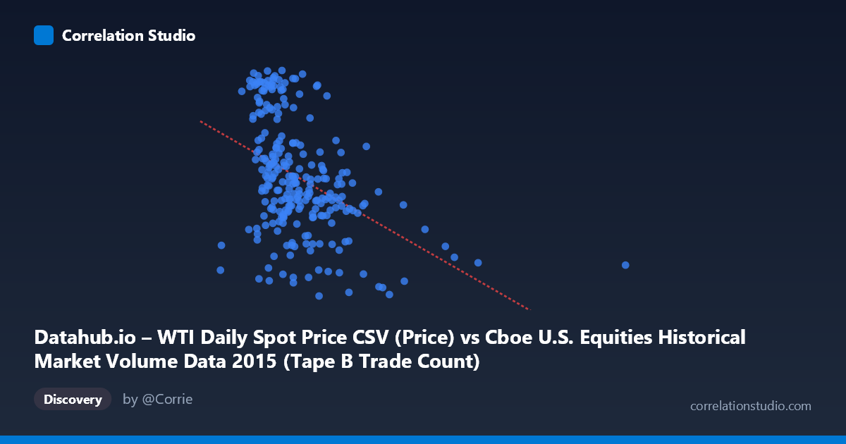
Datahub.io – WTI Daily Spot Price CSV (Price) vs Cboe U.S. Equities Historical Market Volume Data 2015 (Tape B Trade Count)
- Pearson correlation (r)
- -0.4269
- Spearman correlation
- -0.4443
- p-value
- 0
- Sample size (n)
- 252
- 95% confidence interval
- -0.5229 to -0.3202
- Granger causality
- None
- Granger optimal lag
- 1
AI analysis
Analysis: WTI Oil Price vs. Tape B Trade Count (2015)
Relationship Overview The scatterplot reveals a moderate negative relationship between WTI daily spot prices (X-axis) and Cboe Tape B trade counts (Y-axis) across 2015. As oil prices increase, Tape B equity trade counts tend to decline. The linear regression equation (y = -3.12388E-05x + 58.01) quantifies this inverse slope, suggesting that for every $1 increase in oil price (roughly 1 unit on the raw X scale), trade counts decrease marginally but consistently. Visually, the data points form a downward-sloping cloud, with higher trade counts clustering at lower oil price values and sparser, lower-count observations appearing at the higher price range — though substantial vertical scatter is evident throughout.
Correlation Strength and Statistical Significance The Pearson correlation of r = -0.4269 indicates a moderate negative association, but the explanatory power is modest: r² = 0.1822, meaning only 18.2% of the variance in Tape B trade counts is explained by WTI prices. The remaining ~82% is attributable to other factors entirely. The 95% confidence interval of [-0.5229, -0.3202] is meaningfully negative and does not cross zero, reinforcing that the direction is reliable. With a p-value of 1.395E-12 across a sample of 252 paired observations drawn from a population of 3,302, this correlation is highly statistically significant — effectively ruling out chance. However, the Granger causality tests tell a more cautious story: neither direction (X→Y nor Y→X) is statistically significant (F = 0.17, p = 0.68 and F = 0.64, p = 0.42, respectively). This means that despite the contemporaneous correlation, WTI prices do not temporally predict trade counts, nor vice versa, at the tested lag of 1 period. Correlation here should not be interpreted as a predictive or causal mechanism.
Patterns, Clusters, and Outliers Several structural features stand out in the scatterplot. There is a notable cluster of high trade-count observations (Y ~ 55–61) concentrated at lower oil prices (roughly X = 130,000–280,000 range), consistent with the volatile, low-price environment of early-to-mid 2015 when WTI was declining. Conversely, observations with higher X values tend to flatten out in the Y = 40–50 range. A handful of high-X outliers (X 600,000, corresponding to points like (621,009, 40.45) and (640,679, 39.15)) pull the regression line and may represent anomalous trading volume days. There also appears to be a non-linear feature: trade counts drop steeply at lower X values but plateau around Y ≈ 44–48 for mid-to-high X values, hinting that a logarithmic or piecewise model might better capture the relationship than a simple linear fit.
Confounding Factors and Caveats Several important caveats apply. First, both variables are time-indexed to 2015, a year characterized by a dramatic oil price decline — this shared temporal trend (common shock) could be artificially inflating the observed correlation without any true economic linkage. Second, Tape B specifically covers NYSE American and regional exchange listings, which may have sector-specific sensitivities (e.g., energy or commodity-linked equities) that amplify the apparent relationship. Third, macro confounders — Federal Reserve policy signals, broad equity market volatility (VIX), and USD strength — simultaneously influenced both oil prices and trading activity in 2015, making it difficult to isolate a direct relationship. Finally, the unit scaling of X (raw notional or volume values in the hundreds of thousands) versus Y (trade counts in the 35–61 range) warrants scrutiny to ensure the linear model isn't overly sensitive to a few extreme leverage points.
Actionable Insights and Further Investigation Given the moderate correlation but weak Granger causality, this relationship warrants deeper structural investigation rather than direct trading or operational inference. Recommended next steps include: (1) Decomposing the time series to remove shared trends before re-testing correlation, to distinguish genuine co-movement from spurious temporal alignment; (2) Testing non-linear models (log-linear, segmented regression) given the apparent plateau effect at higher X values; (3) Examining sector composition of Tape B on high-activity days to determine whether energy-sector equity trading specifically drives the pattern; (4) Extending the analysis to multiple years to test whether the 2015 oil price crash was a unique structural driver or whether this relationship is persistent; and (5) Incorporating VIX or broader market volume as control variables in a multivariate model to better isolate the oil price signal from generalized market volatility effects.
X dataset: Cboe U.S. Equities Historical Market Volume Data 2015
Y dataset: Datahub.io – WTI Daily Spot Price CSV
Part of experiment: Daily - Cboe U.S. Equities Historical Market Volume Data 2015 vs Datahub.io – WTI Daily Spot Price CSV