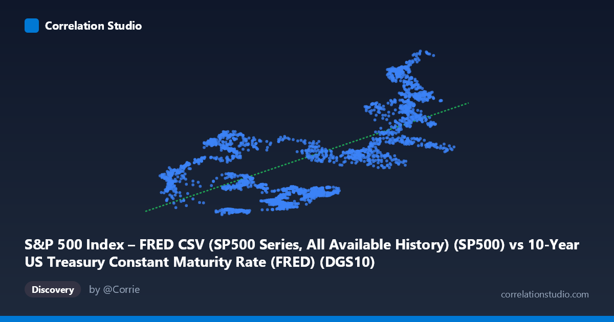
S&P 500 Index – FRED CSV (SP500 Series, All Available History) (SP500) vs 10-Year US Treasury Constant Maturity Rate (FRED) (DGS10)
- Pearson correlation (r)
- 0.6468
- Spearman correlation
- 0.576
- p-value
- 0
- Sample size (n)
- 2497
- 95% confidence interval
- 0.6234 to 0.6691
- Granger causality
- None
- Granger optimal lag
- 10
AI analysis
Analysis: S&P 500 vs. 10-Year US Treasury Yield (2016–2026)
1. Overall Relationship Revealed The scatterplot reveals a positive relationship between the S&P 500 index level and the 10-year US Treasury constant maturity rate — meaning that higher equity index values tend to co-occur with higher Treasury yields over this period. The linear regression (y = 743.82x + 1888.58) suggests that for each 1-percentage-point increase in the 10-year yield, the S&P 500 is associated with an increase of roughly 744 index points above a base of ~1,889. This is a notable and somewhat counterintuitive finding, as conventional financial theory often frames rising rates as a headwind for equities through discounted cash flow compression. The positive slope here likely reflects the shared macroeconomic backdrop of the 2016–2026 window, which encompasses a prolonged expansion, pandemic-era reflation, and post-COVID monetary normalization.
2. Correlation Strength, Direction, and Causality The Pearson correlation of r = 0.647 indicates a moderate-to-strong positive linear association. However, the coefficient of determination R² = 0.418 is the more sobering statistic: only 41.8% of the variance in the S&P 500 is explained by the 10-year yield, leaving nearly 58% attributable to other forces. The 95% confidence interval [0.623, 0.669] is relatively tight given n = 2,497, and the p-value of effectively zero confirms the relationship is statistically significant and not a sampling artifact. Critically, the Granger causality tests find no significant predictive directionality in either direction (X→Y: F = 1.12, p = 0.34; Y→X: F = 0.61, p = 0.81), even at an optimal lag of 10 periods. This means that while the two variables move together contemporaneously, neither reliably forecasts the other temporally — the correlation is associative, not predictive in a causal time-series sense.
3. Notable Patterns, Clusters, and Non-Linearity The sample points reveal two visually distinct clusters that are worth flagging. There is a dense cluster at lower yield values (roughly 0.5–2.5%) paired with a wide spread of S&P 500 values (approximately 2,000–5,000), and a second, more dispersed cluster at higher yields (3.5–5.0%) where S&P 500 values tend to be higher (4,000–7,500). Notably, several high-yield, high-equity points (e.g., 4.29/6,469; 4.41/7,337; 4.29/6,883) suggest the relationship strengthens at the upper end, potentially indicating a non-linear or regime-dependent dynamic. Conversely, some low-yield observations produce relatively high S&P values (e.g., 1.47/4,710; 1.54/4,686), introducing scatter inconsistent with a simple linear model. A non-linear or piecewise fit may better capture regime transitions.
4. Confounding Factors and Caveats The most important caveat is temporal confounding: both variables are driven heavily by the macroeconomic cycle and Federal Reserve policy regime, meaning the correlation may largely reflect shared exposure to a common driver rather than a direct structural link. The 2016–2026 window includes profoundly different regimes — near-zero rates with quantitative easing (2016–2021), aggressive rate hikes (2022–2023), and a high-rate/high-equity environment (2024–2025) — making any single linear model potentially misleading across subperiods. Additionally, the axis labels appear swapped in the dataset metadata (the S&P 500 column comes from the Treasury dataset and vice versa), which warrants data provenance verification before drawing firm conclusions. Survivorship bias and the fact that the S&P 500 is a nominal price index (not inflation-adjusted) further complicate real economic interpretation.
5. Actionable Insights and Further Investigation Given the absence of Granger causality, practitioners should avoid using either variable as a short-term predictor of the other in a tactical trading framework. Instead, further analysis should segment the data by monetary policy regime (e.g., pre-/post-2022 rate hike cycle) to test whether the positive correlation holds within regimes or emerges only as a cross-regime artifact. Rolling correlation analysis (e.g., 252-day windows) would reveal whether the relationship is stable or episodic. Exploring a multivariate model incorporating inflation expectations, earnings growth, and credit spreads would likely substantially improve on the 41.8% explained variance. Finally, testing alternative transformations — log S&P 500 levels, real yields, or yield changes — may produce a more structurally interpretable relationship.
X dataset: 10-Year US Treasury Constant Maturity Rate (FRED)
Y dataset: S&P 500 Index – FRED CSV (SP500 Series, All Available History)
Part of experiment: Daily - 10-Year US Treasury Constant Maturity Rate (FRED) vs S&P 500 Index – FRED CSV (SP500 Series, All Available History)