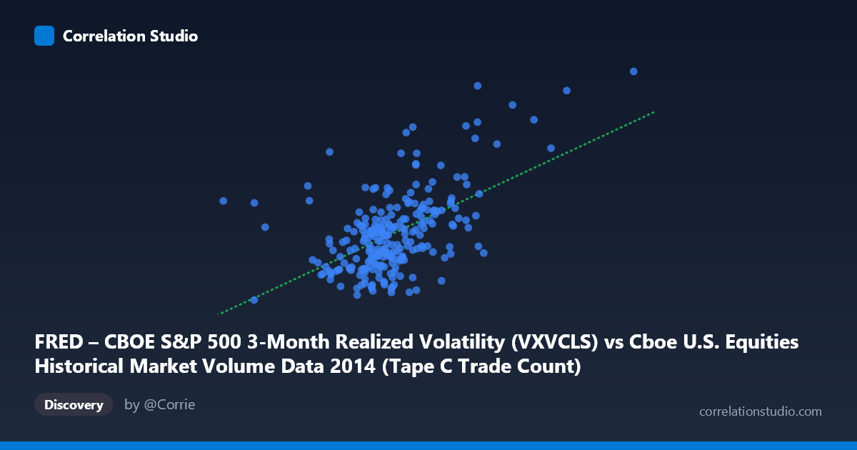
FRED – CBOE S&P 500 3-Month Realized Volatility (VXVCLS) vs Cboe U.S. Equities Historical Market Volume Data 2014 (Tape C Trade Count)
- Pearson correlation (r)
- 0.5476
- Spearman correlation
- 0.4605
- p-value
- 0
- Sample size (n)
- 252
- 95% confidence interval
- 0.4548 to 0.6287
- Granger causality
- X → Y
- Granger optimal lag
- 1
AI analysis
Scatterplot Analysis: CBOE S&P 500 3-Month Realized Volatility vs. Tape C Trade Count (2014)
Relationship Overview
The scatterplot reveals a moderate positive relationship between CBOE S&P 500 3-Month Realized Volatility (VXVCLS) on the X-axis and Tape C Trade Count on the Y-axis across 252 trading days in 2014. As market volatility increases, the number of trades on Tape C (NYSE Arca-listed securities) tends to rise correspondingly. The linear regression equation — y = 1.047×10⁻⁵x + 8.794 — indicates that for every one-unit increase in the volatility index, trade count increases by approximately 0.00001047 units (in whatever scale trade count is expressed), reflecting a gentle but consistent upward slope. This directional alignment is economically intuitive: heightened volatility typically spurs investor activity, risk repositioning, and hedging-related transactions, all of which would drive higher trading volumes.
Correlation Strength and Statistical Significance
The Pearson correlation of r = 0.548 indicates a moderate positive association, and the R² of 0.300 means that approximately 30% of the variance in Tape C Trade Count is explained by VXVCLS — leaving 70% attributable to other factors. The 95% confidence interval of [0.455, 0.629] is reasonably tight and does not approach zero, and the p-value is effectively zero, confirming this relationship is highly statistically significant across the full population of N = 3,686 observations. Critically, the Granger causality results provide directional clarity: X (VXVCLS) Granger-causes Y (Trade Count) at a 1-day lag (F = 4.13, p = 0.043), while the reverse direction shows no predictive power (F = 0.0002, p = 0.988). This suggests that volatility changes temporally precede changes in trade activity, not the other way around — consistent with a market-microstructure narrative where rising implied/realized volatility prompts subsequent trading responses.
Notable Patterns, Clusters, and Outliers
The scatterplot shows a relatively dense central cluster between approximately X = 550,000–750,000 and Y = 13–17, which likely reflects the calm, low-volatility regime that characterized much of early-to-mid 2014. However, two prominent outlier clusters are clearly visible at the upper-right of the chart: points near (1,041,591, 22.85) and (841,278, 23.09) represent episodes of significantly elevated volatility paired with very high trade counts. These are likely associated with the October 2014 market selloff, a well-documented period of sharp VIX spikes driven by Ebola fears, European recession concerns, and Fed tapering anxiety. A handful of lower-left outliers also exist — low trade counts at moderate-to-low volatility — which may reflect holiday-shortened sessions or anomalous liquidity conditions. The relationship appears somewhat non-linear at the extremes, with trade counts accelerating disproportionately at the highest volatility readings, hinting at a possible convex response function.
Confounding Factors and Caveats
Several important caveats limit causal interpretation. First, VXVCLS measures 3-month realized volatility, which is a backward-looking, smoothed metric — its correlation with a single day's trade count blends different time horizons and may introduce phase-lag artifacts beyond the 1-day Granger window tested. Second, Tape C specifically covers NYSE Arca-listed securities (largely ETFs), which are themselves heavily used as volatility-trading instruments; this could inflate the apparent correlation relative to the broader market. Third, secular trends in electronic trading and market structure changes during 2014 could simultaneously drive both variables upward, acting as a common confounder. Fourth, the note that the axes appear swapped in the metadata (VXVCLS listed as X but sourced from the Trade Count dataset, and vice versa) warrants careful verification of variable assignment before drawing firm conclusions. Finally, with only one year of data (252 observations), regime-specific behavior (e.g., the October shock) may be disproportionately influencing the correlation estimate.
Actionable Insights and Further Investigation
The finding that VXVCLS Granger-causes Tape C Trade Count at a 1-day lag is practically actionable: market participants and venue operators could use the prior day's realized volatility reading as a leading signal for expected next-day trading activity on Arca-listed instruments, informing capacity planning, liquidity provisioning, and ETF hedging desk positioning. However, given that only 30% of variance is explained, a multi-factor model incorporating VIX term structure, options expiration cycles, and macro event calendars would likely yield substantially stronger predictive power. Further investigation should include: (1) extending the analysis beyond 2014 to test stability across multiple market regimes; (2) testing non-linear specifications (log transforms, piecewise regression) given the apparent convexity at high volatility levels; (3) decomposing Tape C trade count by instrument type (ETFs vs. equities) to isolate the volatility-trading channel; and (4) examining whether the Granger relationship holds at lags beyond 1 day or breaks down during extreme stress periods.
X dataset: Cboe U.S. Equities Historical Market Volume Data 2014
Y dataset: FRED – CBOE S&P 500 3-Month Realized Volatility
Part of experiment: Daily - Cboe U.S. Equities Historical Market Volume Data 2014 vs FRED – CBOE S&P 500 3-Month Realized Volatility