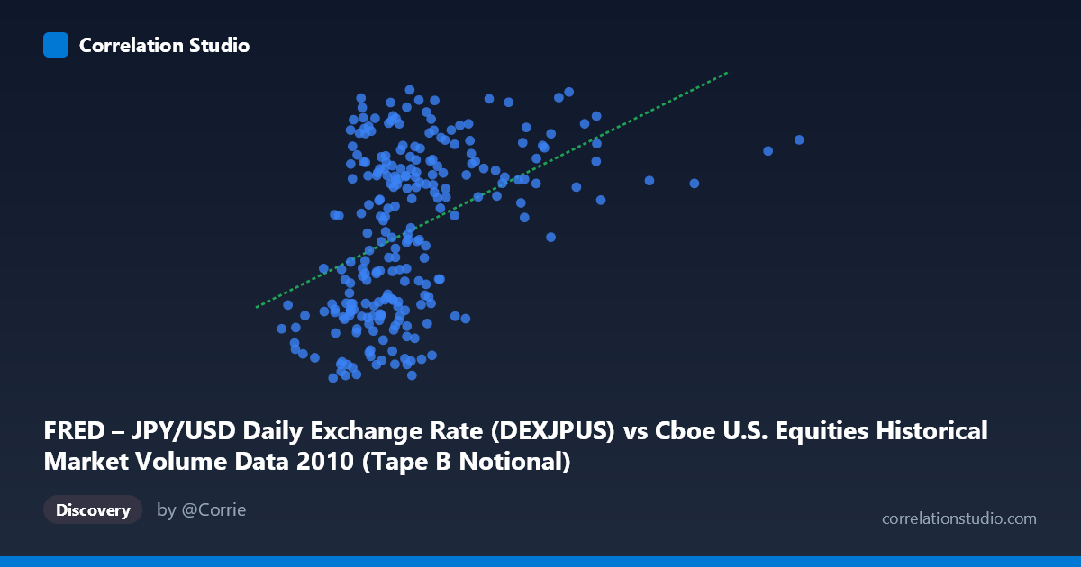
FRED – JPY/USD Daily Exchange Rate (DEXJPUS) vs Cboe U.S. Equities Historical Market Volume Data 2010 (Tape B Notional)
- Pearson correlation (r)
- 0.443
- Spearman correlation
- 0.45
- p-value
- 0
- Sample size (n)
- 249
- 95% confidence interval
- 0.3373 to 0.5377
- Granger causality
- None
- Granger optimal lag
- 1
AI analysis
Scatterplot Analysis: JPY/USD Exchange Rate vs. Cboe Tape B Notional Volume (2010)
Relationship Overview
The scatterplot reveals a modest positive relationship between the JPY/USD daily exchange rate (X-axis, measured in notional value terms from Cboe market volume data) and Tape B notional trading volume (Y-axis, representing the JPY/USD rate from FRED). The axes appear to have been swapped in labeling relative to their dataset origins, which is an important interpretive caveat. Visually, the data points form a broadly dispersed cloud with a slight upward trend, consistent with the positive correlation coefficient. The relationship is real but far from deterministic, with considerable scatter throughout the range of both variables.
Correlation Strength and Statistical Significance
The Pearson correlation of r = 0.443 indicates a moderate positive association, but the coefficient of determination r² = 0.196 tells a more sobering story: only 19.6% of the variance in Y is explained by X, leaving roughly 80% attributable to other factors. The 95% confidence interval of [0.337, 0.538] is meaningfully above zero and relatively tight given the sample size (n = 249), suggesting genuine stability in the estimate. The p-value of 2.15 × 10⁻¹³ is overwhelmingly significant, confirming this is not a chance finding across the N = 3,302 population. However, statistical significance should not be conflated with practical importance — the effect size remains modest. Critically, Granger causality tests find no significant temporal predictive direction in either direction (X→Y: F = 0.357, p = 0.551; Y→X: F = 0.273, p = 0.602), meaning neither variable meaningfully predicts future values of the other at a one-period lag. This substantially weakens any causal narrative linking the two series.
Notable Patterns, Clusters, and Outliers
Several structural features stand out in the sample points. There is a visible cluster of observations concentrated in the X range of roughly 3.5–6.5 billion, corresponding to Y values spanning approximately 82–94, which likely reflects the modal trading environment during 2010. The distribution of X values is notably right-skewed, with a handful of extreme observations extending toward 10–16 billion — these high-volume days appear to occur at varying Y levels, contributing to the weak upper-range relationship. A few potential outliers are visible, including the minimum X value (≈1.61 billion, Y ≈ 82.91) and the maximum X point (≈15.96 billion), which may represent abnormal market events such as the May 6, 2010 Flash Crash or other volatility spikes. The Y range is relatively compressed (80.48–94.68, a spread of ~14 units), which naturally caps the explanatory ceiling.
Confounding Factors and Interpretive Caveats
Several important caveats apply. First, the label mismatch between axes (each column appears attributed to the other dataset) raises concerns about whether the relationship is being measured as intended — this should be verified before drawing conclusions. Second, both series are time-ordered daily data from a single calendar year (2010), meaning shared macroeconomic drivers — such as post-financial-crisis risk sentiment, Federal Reserve policy shifts, and global capital flows — could easily produce a spurious correlation driven by common trends rather than a direct link. Third, the JPY/USD rate in 2010 was under persistent appreciation pressure due to yen safe-haven demand, which may have coincided with elevated U.S. equity volumes during risk-off episodes, creating a confounded signal. Finally, Tape B specifically covers NYSE Arca and related venues, making it a partial, not total, measure of U.S. equity activity.
Actionable Insights and Further Investigation
Given the moderate correlation but absent Granger causality, the most productive next steps would include: (1) correcting and confirming the axis labeling to ensure the relationship is being evaluated as intended; (2) controlling for common macro drivers — particularly VIX (implied volatility), S&P 500 returns, and Fed announcements — to test whether the correlation survives as a partial correlation; (3) extending the analysis across multiple years (FRED JPY/USD data extends to the present) to assess whether the 2010 relationship is structurally persistent or idiosyncratic to post-crisis conditions; and (4) testing non-linear specifications, as the dispersed cloud and skewed X distribution hint that a log transformation of the volume variable might improve model fit and interpretability. The Flash Crash outlier observations should be isolated and analyzed separately to assess their disproportionate influence on the regression slope.
X dataset: Cboe U.S. Equities Historical Market Volume Data 2010
Y dataset: FRED – JPY/USD Daily Exchange Rate
Part of experiment: Daily - Cboe U.S. Equities Historical Market Volume Data 2010 vs FRED – JPY/USD Daily Exchange Rate