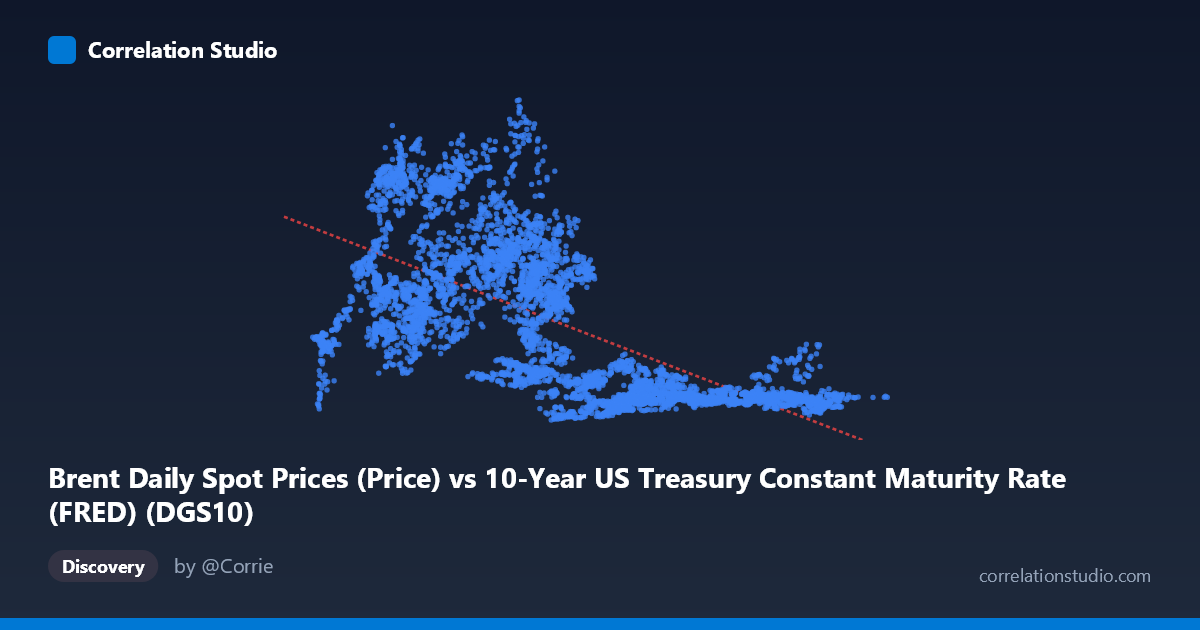
Brent Daily Spot Prices (Price) vs 10-Year US Treasury Constant Maturity Rate (FRED) (DGS10)
- Pearson correlation (r)
- -0.657
- Spearman correlation
- -0.709
- p-value
- 0
- Sample size (n)
- 9642
- 95% confidence interval
- -0.6682 to -0.6455
- Granger causality
- None
- Granger optimal lag
- 1
AI analysis
Brent Crude Oil Prices vs. 10-Year US Treasury Yield: Correlation Analysis
Relationship Overview
The scatterplot reveals a negative relationship between the 10-year US Treasury yield (X-axis) and Brent crude oil spot prices (Y-axis), described by the linear regression equation y = -9.68x + 95.13. At first glance, this implies that as Treasury yields rise, oil prices tend to fall — and vice versa. However, the scatter of points across the chart tells a more nuanced story: the relationship is far from clean or deterministic. Many data points deviate substantially from the regression line, and the spread is notably wide across the middle range of X values (roughly 4–6%), where oil prices span from under $20 to well over $100 per barrel. This visual dispersion immediately signals that while a trend exists, the linear model captures only part of what is driving oil prices.
Correlation Strength and Statistical Significance
The Pearson correlation of r = -0.657 reflects a moderate-to-strong negative association, but the coefficient of determination r² = 0.4316 is the more sobering figure — it means that Treasury yields explain only 43.2% of the variance in Brent crude prices, leaving 56.8% attributable to other factors. The 95% confidence interval for r is tight at [-0.668, -0.646], and the p-value is effectively zero across a paired sample of n = 9,642 observations, confirming that this correlation is statistically robust and not a sampling artifact. Despite this statistical certainty, the Granger causality results tell a different story about predictive utility: neither direction (X→Y nor Y→X) achieves significance (F = 0.52, p = 0.47 for X→Y; F = 1.34, p = 0.25 for Y→X at lag 1). This is a critical distinction — the variables are correlated, but neither reliably predicts the other temporally. The correlation likely reflects shared macroeconomic regimes rather than a direct causal mechanism.
Notable Patterns, Clusters, and Outliers
Several structural features stand out in the data. There is a dense cluster of low-price, high-yield observations in the lower-right region of the chart, corresponding to the pre-1990s era when oil was cheap and interest rates were elevated. Conversely, a concentration of high-price, low-yield points appears in the upper-left, consistent with the 2005–2014 period of low rates and an oil price supercycle. A striking feature is the vertical spread at mid-range X values (~4–6%): oil prices here range from roughly $10 to over $140 per barrel, which dramatically undermines the predictive power of yield alone at those interest rate levels. Several apparent outliers in the upper range (Y $120) likely correspond to the 2008 oil price spike and the 2022 post-Ukraine-invasion surge — periods of supply shocks that a yield-based model cannot capture. The non-linear clustering suggests the relationship may be regime-dependent, shifting across different economic eras.
Confounding Factors and Interpretive Caveats
This correlation almost certainly reflects shared exposure to macroeconomic regimes rather than a direct causal link. Both variables are deeply influenced by Fed monetary policy cycles, global growth expectations, inflation dynamics, and risk appetite — all of which can simultaneously push yields down and oil prices up (e.g., quantitative easing periods), or vice versa. The dataset spans nearly four decades (1987–2026), encompassing vastly different structural environments: the Cold War end, the dot-com boom, the 2008 financial crisis, COVID-19, and the post-2021 inflation shock. Structural breaks across these periods likely inflate the apparent correlation, making it partly a historical artifact of regime co-movement rather than a stable relationship. Furthermore, oil prices are heavily influenced by OPEC supply decisions, geopolitical events, and USD exchange rate fluctuations — none of which are captured by Treasury yields.
Actionable Insights and Further Investigation
Despite the caveats, the moderate correlation and large sample size make this relationship worth exploring further in a more sophisticated modeling framework. Key next steps would include: (1) regime-segmented analysis — splitting the dataset by monetary policy era (e.g., pre/post-2008 QE, post-2022 rate hike cycle) to test whether the correlation is stable or period-dependent; (2) adding control variables such as USD index, global GDP growth, OPEC production levels, and inflation expectations to build a more complete predictive model; (3) testing non-linear specifications (e.g., polynomial or piecewise regression) given the evident spread in mid-range X values; and (4) extending Granger causality testing to longer lags (beyond lag 1) to check for slower-moving predictive relationships. Practitioners should avoid using Treasury yields alone as a signal for oil price direction — the 57% unexplained variance and lack of Granger causality make it an unreliable standalone indicator for trading or forecasting purposes.
X dataset: 10-Year US Treasury Constant Maturity Rate (FRED)
Y dataset: Brent Daily Spot Prices
Part of experiment: Daily - 10-Year US Treasury Constant Maturity Rate (FRED) vs Brent Daily Spot Prices