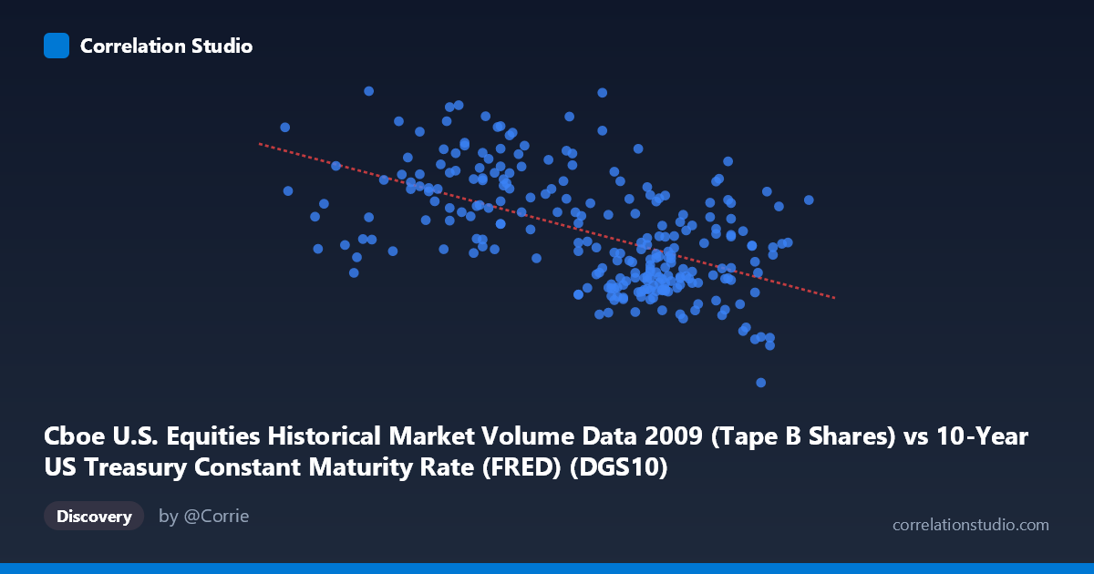
Cboe U.S. Equities Historical Market Volume Data 2009 (Tape B Shares) vs 10-Year US Treasury Constant Maturity Rate (FRED) (DGS10)
- Pearson correlation (r)
- -0.5559
- Spearman correlation
- -0.5384
- p-value
- 0
- Sample size (n)
- 250
- 95% confidence interval
- -0.6361 to -0.4638
- Granger causality
- None
- Granger optimal lag
- 10
AI analysis
Analysis: 10-Year Treasury Yield vs. Cboe Tape B Equity Volume (2009)
Relationship Overview
The scatterplot reveals a moderate negative relationship between the 10-year US Treasury constant maturity rate (X-axis) and Cboe Tape B equity share volume (Y-axis) across 2009 trading days. The linear regression equation (y = -61,008,900x + 346,402,000) indicates that for each one-percentage-point increase in the 10-year yield, daily equity volume is associated with a decrease of roughly 61 million shares. This inverse relationship is visually apparent in the downward slope across the scatter, with higher-yield periods (approaching ~3.8–4.0%) clustering around lower volume figures, while lower-yield periods (~2.3–2.9%) tend to coincide with substantially higher trading volumes — consistent with the early 2009 financial crisis environment when yields were suppressed and market volatility-driven trading was elevated.
Correlation Strength and Statistical Significance
The correlation coefficient of r = -0.5559 indicates a moderate negative association, and the r² of 0.309 means that approximately 30.9% of the variance in equity volume is explained by the Treasury yield level — meaningful but leaving nearly 70% of variation unexplained by this single variable alone. The 95% confidence interval of [-0.6361, -0.4638] is reasonably tight and entirely negative, providing strong statistical confidence that the inverse direction of this relationship is not a sampling artifact. With a p-value effectively at zero across an N of 3,232 population observations, the correlation is highly statistically significant. However, Granger causality tests reveal no significant temporal predictive relationship in either direction (X→Y: F=1.27, p=0.25; Y→X: F=1.60, p=0.11), meaning that knowing today's yield does not meaningfully help predict tomorrow's volume, and vice versa — the correlation appears to be contemporaneous and structural rather than directionally causal in a lead-lag sense.
Notable Patterns, Clusters, and Outliers
Several features stand out in the sample points. There is a pronounced cluster of observations in the 3.4–3.6% yield range with volumes between ~85M and ~175M shares, forming the dense core of the distribution. However, considerable vertical spread exists within this cluster, reflecting substantial volume variability at similar yield levels. A handful of notable outliers are visible: the point at approximately (3.29, 254,504,133) represents anomalously high volume for its yield level, and (2.78, 243,585,656) similarly shows extreme volume during a low-yield period — both likely corresponding to specific high-volatility or crisis-event trading days in early 2009. At the upper yield extreme, (3.82, 33,822,027) is the single lowest-volume observation, consistent with the negative trend. The relationship also shows possible non-linearity, with volume appearing to rise more steeply as yields drop below ~2.8%, suggesting a threshold or accelerating effect during the most acute crisis conditions.
Confounding Factors and Caveats
Several important caveats apply. 2009 is a structurally unusual year — the post-Lehman financial crisis produced extreme market dislocations, meaning yields were being held artificially low by Federal Reserve policy (near-zero fed funds rate, early QE) while simultaneously, fear and volatility were driving exceptional trading volumes. This creates a spurious correlation risk: both low yields and high volumes may be common responses to the same underlying crisis conditions rather than causally linked. The dataset label mismatch (the X-axis column name references Cboe volume data but is identified as the Treasury yield, and vice versa) warrants careful verification before drawing operational conclusions. Additionally, Tape B specifically covers regional exchange activity, which may respond differently to macro conditions than overall market volume. Seasonal patterns, earnings cycles, and index rebalancing events could also be driving volume variation independently of yield movements.
Actionable Insights and Further Investigation
Given the moderate but incomplete explanatory power of this relationship, several follow-up analyses are warranted. Regime segmentation — splitting the data into the acute crisis phase (Q1 2009) versus recovery phase (Q3–Q4 2009) — would test whether the correlation is driven primarily by one sub-period. Including VIX or credit spread data as covariates would help disentangle whether yield or risk sentiment is the more proximate driver of volume. A non-linear regression or spline fit should be explored given the possible threshold behavior below 2.8%. Extending the analysis across multiple years (2008–2012) would reveal whether this negative relationship persists outside crisis conditions or reverses in more normal rate environments. Finally, repeating the Granger causality test at shorter lags (1–3 days) rather than the optimal 10-period lag may uncover short-term predictive signals masked at longer horizons.
X dataset: 10-Year US Treasury Constant Maturity Rate (FRED)
Y dataset: Cboe U.S. Equities Historical Market Volume Data 2009
Part of experiment: Daily - 10-Year US Treasury Constant Maturity Rate (FRED) vs Cboe U.S. Equities Historical Market Volume Data 2009